9: sPlot
This notebook explains sPlot and how to use zfit and hepstats to compute the sWeights with compute_sweights. Alternatively, if the probabilities are already available, hep_ml.splot can be used. sPlot is a way to reconstruct features of mixture components based on known properties of distributions. This method is frequently used in High Energy Physics.
If you prefer explanations without code, find them here
[1]:
import mplhep
import numpy as np
import zfit
from matplotlib import pyplot as plt
/usr/share/miniconda/envs/analysis-essentials/lib/python3.11/site-packages/zfit/__init__.py:60: UserWarning: TensorFlow warnings are by default suppressed by zfit. In order to show them, set the environment variable ZFIT_DISABLE_TF_WARNINGS=0. In order to suppress the TensorFlow warnings AND this warning, set ZFIT_DISABLE_TF_WARNINGS=1.
  warnings.warn(
2025-04-04 10:42:29.909089: E external/local_xla/xla/stream_executor/cuda/cuda_fft.cc:467] Unable to register cuFFT factory: Attempting to register factory for plugin cuFFT when one has already been registered
WARNING: All log messages before absl::InitializeLog() is called are written to STDERR
E0000 00:00:1743763349.923349    5345 cuda_dnn.cc:8579] Unable to register cuDNN factory: Attempting to register factory for plugin cuDNN when one has already been registered
E0000 00:00:1743763349.927929    5345 cuda_blas.cc:1407] Unable to register cuBLAS factory: Attempting to register factory for plugin cuBLAS when one has already been registered
W0000 00:00:1743763349.940070    5345 computation_placer.cc:177] computation placer already registered. Please check linkage and avoid linking the same target more than once.
W0000 00:00:1743763349.940080    5345 computation_placer.cc:177] computation placer already registered. Please check linkage and avoid linking the same target more than once.
W0000 00:00:1743763349.940082    5345 computation_placer.cc:177] computation placer already registered. Please check linkage and avoid linking the same target more than once.
W0000 00:00:1743763349.940084    5345 computation_placer.cc:177] computation placer already registered. Please check linkage and avoid linking the same target more than once.
[2]:
size = 10000
sig_data = np.random.normal(-1, 1, size=size)
bck_data = np.random.normal(1, 1, size=size)
Simple sPlot example
First we start with a simple (and not very useful in practice) example:
Assume we have two types of particles (say, electrons and positrons).
Distribution of some characteristic is different for them (let this be \(p_x\) momentum projection).
[3]:
plt.hist(sig_data, color='b', alpha=0.5, bins=30, label='electron')
plt.hist(bck_data, color='r', alpha=0.5, bins=30, label='positron')
plt.xlim(-5, 5), plt.xlabel('$p_x$')
plt.legend()
[3]:
<matplotlib.legend.Legend at 0x7f2e901d0450>
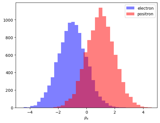
Observed distributions
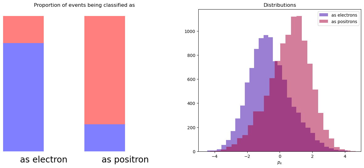
Picture above shows how this distibution should look like, but due to inaccuracies during classification we will observe a different picture.
Let’s assume that with a probability of 80% particle is classified correctly (and we are not using \(p_x\) during classification).
And when we look at distribution of px for particles which were classified as electrons or positrons, we see that they were distorted. We lost the original shapes of distributions.
[4]:
n_sig1, n_bck1 = 8000, 2000
n_sig2, n_bck2 = 2000, 8000
first_bin = np.concatenate([sig_data[:n_sig1], bck_data[:n_bck1]])
second_bin = np.concatenate([sig_data[n_sig1:], bck_data[n_bck1:]])
[5]:
plt.figure(figsize=[15, 6])
plt.subplot(121)
plt.bar([0, 2], [n_sig1, n_sig2], width=1, color='b', alpha=0.5)
plt.bar([0, 2], [n_bck1, n_bck2], width=1, bottom=[n_sig1, n_sig2], color='r', alpha=0.5)
plt.xlim(-0.5, 3.5)

plt.axis('off')
plt.xticks([0.5, 2.5], ['as electrons', 'as positrons'])
plt.text(0.5, -300, 'as electron', horizontalalignment='center', verticalalignment='top', fontsize=20)
plt.text(2.5, -300, 'as positron', horizontalalignment='center', verticalalignment='top', fontsize=20)
plt.title('Proportion of events being classified as')

plt.subplot(122)
plt.hist(first_bin, alpha=0.5, bins=30, label='as electrons', color=(0.22, 0., 0.66))
plt.hist(second_bin, alpha=0.5, bins=30, label='as positrons', color=(0.66, 0., 0.22))
plt.legend()
plt.title('Distributions')
plt.xlim(-5, 5), plt.xlabel('$p_x$')
pass
Applying sWeights
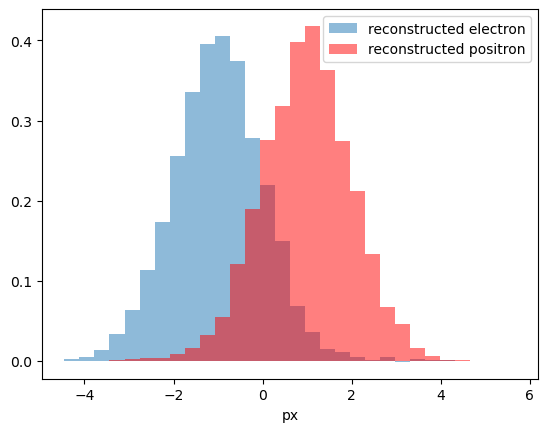
We can think of it in the following way: there are 2 bins. In first 80% are electrons, 20% are signal. And visa versa in second bin.
To reconstruct initial distribution, we can plot histogram, where each event from first bin has weight 0.8, and each event from second bin has weight -0.2. This numbers are called sWeights.
So, if we had 8000 \(e^{-}\) + 2000 \(e^{+}\) in first bin and 8000 \(e^{+}\) + 2000 \(e^{-}\) ($ e^-, e^+$ are electron and positron). After summing with introduced sWeights:
Positrons with positive and negative weights compensated each other, and we will get pure electrons.
At this moment we ignore normalization of sWeights (because it doesn’t play role when we want to reconstruct shape).
[6]:
def plot_with_weights(datas, weights, **kargs):
    assert len(datas) == len(weights)
    data = np.concatenate(datas)
    weight = np.concatenate([np.ones(len(d)) * w for d, w in zip(datas, weights) ])
    plt.hist(data, weights=weight, alpha=0.5, bins=30, **kargs)
[7]:
plot_with_weights([first_bin, second_bin], [n_bck2, -n_bck1], density=True, label='reconstructed electron')
plot_with_weights([first_bin, second_bin], [-n_sig2, n_sig1], density=True, color='r', label='reconstructed positron')
plt.xlabel('px')
plt.legend();
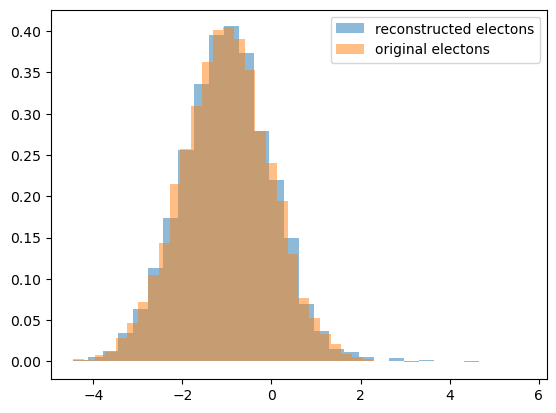
Compare
let’s compare reconstructed distribution for electrons with an original one:
[8]:
plot_with_weights([first_bin, second_bin], [n_bck2, -n_bck1], density=True, label='reconstructed electons', edgecolor='none')
plot_with_weights([sig_data], [1], density=True, label='original electons', edgecolor='none')
plt.legend();
More complex case
In the case when we have only two ‘bins’ is simple and straightforward. But when there are more than two bins, the solution is not unique. There are many appropriate combinations of sWeights, which one to choose?
[9]:
plt.bar([0, 2, 4], [3, 2, 1], width=1, color='b', alpha=0.5)
plt.bar([0, 2, 4], [1, 2, 3], width=1, bottom=[3, 2, 1], color='r', alpha=0.5)

plt.xlim(-1, 6)
plt.ylim(-0.5, 5)
plt.axis('off')

plt.text(0.5, -0.5, 'Bin 1', horizontalalignment='center', verticalalignment='top', fontsize=20)
plt.text(2.5, -0.5, 'Bin 2', horizontalalignment='center', verticalalignment='top', fontsize=20)
plt.text(4.5, -0.5, 'Bin 3', horizontalalignment='center', verticalalignment='top', fontsize=20)
pass
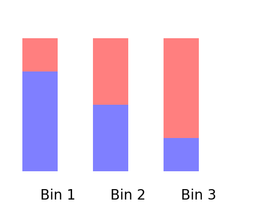
Things in practice are however even more complex. We have not bins, but continuos distribution (which can be treated as many bins).
Typically this is a distribution over mass. By fitting mass we are able to split mixture into two parts: signal channel and everything else.
Splot
This is now an demonstration of the sPlot algorithm, described in Pivk:2004ty.
If a data sample is populated by different sources of events, like signal and background, sPlot is able to unfold the contributions of the different sources for a given variable.
Let’s construct a dataset with two variables, the invariant mass and lifetime, for the resonant signal defined above and the combinatorial background. To do this, we build the model in zfit.
[10]:
mu = zfit.Parameter('mu', 5279, 5100, 5400)
sigma = zfit.Parameter('sigma', 20, 1, 200)

lambd = zfit.Parameter('lambda', -0.002, -0.01, 0.0001)
2025-04-04 10:42:33.512396: E external/local_xla/xla/stream_executor/cuda/cuda_platform.cc:51] failed call to cuInit: INTERNAL: CUDA error: Failed call to cuInit: UNKNOWN ERROR (303)
[11]:
obs = zfit.Space('mass', (5000, 6000))

signal_pdf = zfit.pdf.Gauss(mu=mu, sigma=sigma, obs=obs)
comb_bkg_pdf = zfit.pdf.Exponential(lambd, obs=obs)

sig_yield = zfit.Parameter('sig_yield', 25000, 0, 50000,
                                step_size=1)  # step size: default is small, use appropriate
bkg_yield = zfit.Parameter('bkg_yield', 100000, 0, 3e5, step_size=1)

# Create the extended models
extended_sig = signal_pdf.create_extended(sig_yield)
extended_bkg = comb_bkg_pdf.create_extended(bkg_yield)

# The final model is the combination of the signal and backgrond PDF
model = zfit.pdf.SumPDF([extended_bkg, extended_sig])
[12]:
# Signal distributions.
nsig_sw = 20000
np_sig_m_sw = signal_pdf.sample(nsig_sw).numpy().reshape(-1,)
np_sig_t_sw = np.random.exponential(size=nsig_sw, scale=1)

# Background distributions.
nbkg_sw = 150000
np_bkg_m_sw = comb_bkg_pdf.sample(nbkg_sw).numpy().reshape(-1,)
np_bkg_t_sw = np.random.normal(size=nbkg_sw, loc=2.0, scale=2.5)

# Lifetime cut.
t_cut = np_bkg_t_sw > 0
np_bkg_t_sw = np_bkg_t_sw[t_cut]
np_bkg_m_sw = np_bkg_m_sw[t_cut]

# Mass distribution
np_m_sw = np.concatenate([np_sig_m_sw, np_bkg_m_sw])

# Lifetime distribution
np_t_sw = np.concatenate([np_sig_t_sw, np_bkg_t_sw])

# Plots the mass and lifetime distribution.
fig, axs = plt.subplots(1, 2, figsize=(16, 6))
axs[0].hist([np_bkg_m_sw, np_sig_m_sw], bins=50, stacked=True, label=("background", "signal"), alpha=.7)
axs[0].set_xlabel("m")
axs[0].legend(fontsize=15)
axs[1].hist([np_bkg_t_sw, np_sig_t_sw], bins=50, stacked=True, label=("background", "signal"), alpha=.7)
axs[1].set_xlabel("t")
axs[1].legend(fontsize=15);
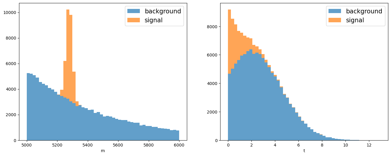
In this particular example we want to unfold the signal lifetime distribution. To do so sPlot needs a discriminant variable to determine the yields of the various sources using an extended maximum likelihood fit.
[13]:
# Builds the loss.
data_sw = zfit.Data.from_numpy(obs=obs, array=np_m_sw)
nll_sw = zfit.loss.ExtendedUnbinnedNLL(model, data_sw)

# This parameter was useful in the simultaneous fit but not anymore so we fix it.
sigma.floating = False

# Minimizes the loss.
minimizer = zfit.minimize.Minuit(use_minuit_grad=True)
result_sw = minimizer.minimize(nll_sw)
print(result_sw.params)
name         value  (rounded)    at limit
---------  ------------------  ----------
bkg_yield              118125       False
sig_yield             19984.8       False
lambda            -0.00199335       False
mu                    5278.99       False
[14]:
def plot_fit_projection(model, data, nbins=30, ax=None):
    # The function will be reused.
    if ax is None:
        ax = plt.gca()

    lower, upper = data.data_range.limit1d

    # Creates and histogram of the data and plots it with mplhep.
    counts, bin_edges = np.histogram(data.unstack_x(), bins=nbins)
    mplhep.histplot(counts, bins=bin_edges, histtype="errorbar", yerr=True,
                    label="Data", ax=ax, color="black")

    binwidth = np.diff(bin_edges)[0]
    x = np.linspace(lower, upper, num=1000)  # or np.linspace

    # Line plots of the total pdf and the sub-pdfs.
    y = model.ext_pdf(x) * binwidth
    ax.plot(x, y, label="total", color="royalblue")
    for m, l, c in zip(model.get_models(), ["background", "signal"], ["forestgreen", "crimson"]):
        ym = m.ext_pdf(x) * binwidth
        ax.plot(x, ym, label=l, color=c)

    ax.set_title(data.data_range.obs[0])
    ax.set_xlim(lower, upper)
    ax.legend(fontsize=15)

    return ax
[15]:
# Visualization of the result.
zfit.param.set_values(nll_sw.get_params(), result_sw)
plot_fit_projection(model, data_sw, nbins=100)
[15]:
<Axes: title={'center': 'mass'}>
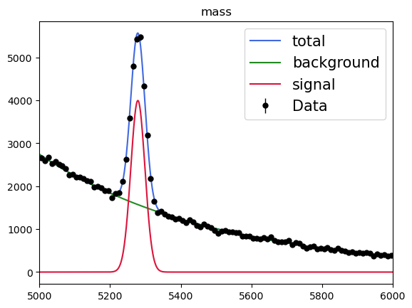
sPlot will use the fitted yield for each sources to derive the so-called sWeights for each data point:
\begin{equation} W_{n}(x) = \frac{\sum_{j=1}^{N_S} V_{nj} f_j(x)}{\sum_{k=1}^{N_S} N_{k}f_k(x)} \end{equation}
with
\begin{equation} V_{nj}^{-1} = \sum_{e=1}^{N} \frac{f_n(x_e) f_j(x_e)}{(\sum_{k=1}^{N_S} N_{k}f_k(x))^2} \end{equation}
where \({N_S}\) is the number of sources in the data sample, here 2. The index \(n\) represents the source, for instance \(0\) is the signal and \(1\) is the background, then \(f_0\) and \(N_0\) are the pdf and yield for the signal.
In hepstats the sWeights are computed with the compute_sweights function which takes as arguments the fitted extended model and the discrimant data (on which the fit was performed).
[16]:
from hepstats.splot import compute_sweights

weights = compute_sweights(model, data_sw)

print(weights)
{<zfit.Parameter 'bkg_yield' floating=True value=1.181e+05>: array([-0.15826615,  0.1157568 ,  0.08109543, ...,  1.12203773,
        1.12202902,  1.12203773]), <zfit.Parameter 'sig_yield' floating=True value=1.998e+04>: array([ 1.15826206,  0.88424155,  0.91890262, ..., -0.12203041,
       -0.1220217 , -0.12203041])}
[17]:
print("Sum of signal sWeights: ", np.sum(weights[sig_yield]))
print("Sum of background sWeights: ", np.sum(weights[bkg_yield]))
Sum of signal sWeights:  19984.783263520614
Sum of background sWeights:  118124.8994175261
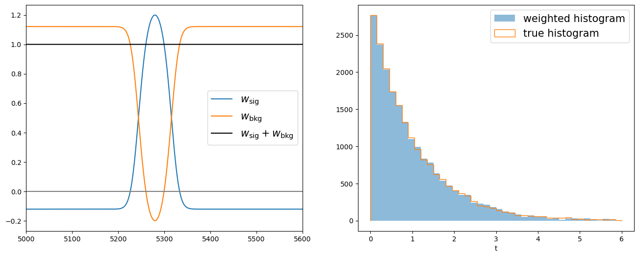
Now we can apply the signal sWeights on the lifetime distribution and retrieve its signal components.
[18]:
fig, axs = plt.subplots(1, 2, figsize=(16, 6))
nbins = 40

sorter = np_m_sw.argsort()

axs[0].plot(np_m_sw[sorter], weights[sig_yield][sorter], label="$w_\\mathrm{sig}$")
axs[0].plot(np_m_sw[sorter], weights[bkg_yield][sorter], label="$w_\\mathrm{bkg}$")
axs[0].plot(np_m_sw[sorter], weights[sig_yield][sorter] + weights[bkg_yield][sorter],
            "-k", label="$w_\\mathrm{sig} + w_\\mathrm{bkg}$")
axs[0].axhline(0, color="0.5")
axs[0].legend(fontsize=15)
axs[0].set_xlim(5000, 5600)

axs[1].hist(np_t_sw, bins=nbins, range=(0, 6), weights=weights[sig_yield], label="weighted histogram", alpha=.5)
axs[1].hist(np_sig_t_sw, bins=nbins, range=(0, 6), histtype="step", label="true histogram", lw=1.5)
axs[1].set_xlabel("t")
axs[1].legend(fontsize=15);
Be careful the sPlot technique works only on variables that are uncorrelated with the discriminant variable.
[19]:
print(f"Correlation between m and t: {np.corrcoef(np_m_sw, np_t_sw)[0, 1]}")
Correlation between m and t: 0.038501881629264635
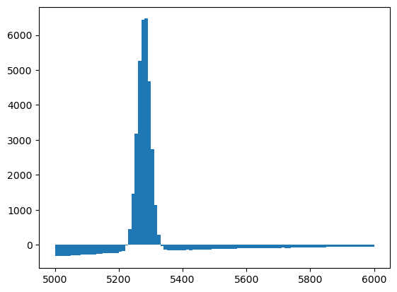
Let’s apply to signal sWeights on the mass distribution to see how bad the results of sPlot is when applied on a variable that is correlated with the discrimant variable.
[20]:
plt.hist(np_m_sw, bins=100, range=(5000, 6000), weights=weights[sig_yield]);
Alternative: Known probabilities
If the probabilities are already known beforehand, fitting a curve with zfit is an extra step that is not required in order to obtain the sWeights. The next example uses hep_ml in order to compute the sWeights; the same function as hepstats also uses internally.
Building sPlot over mass
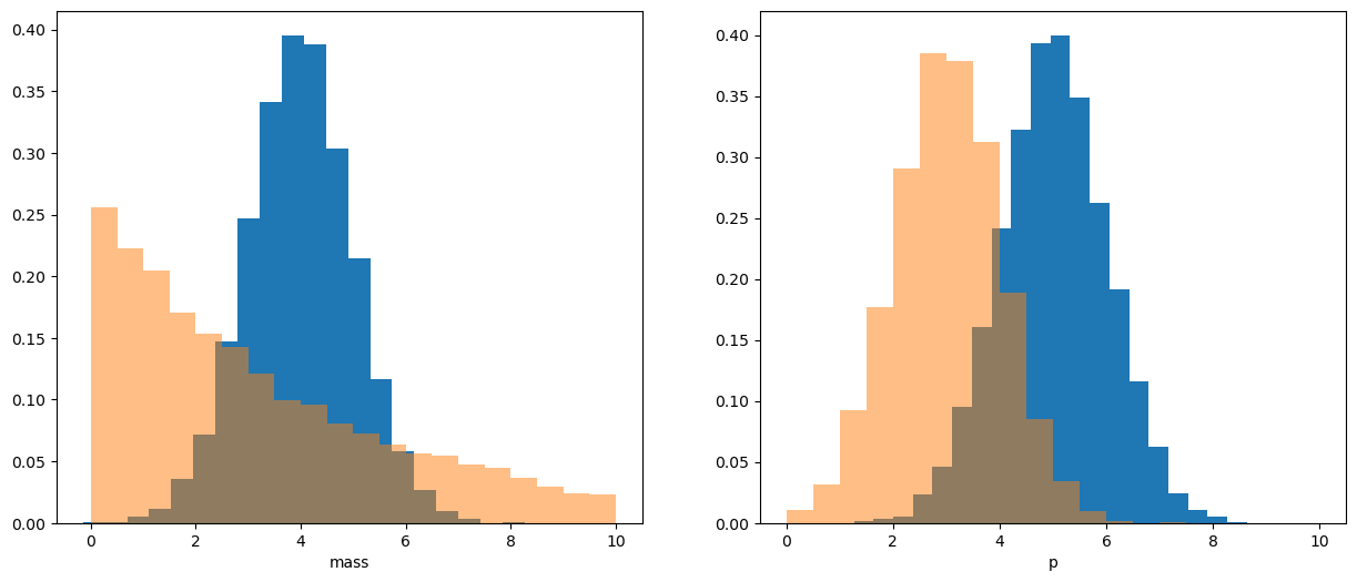
Let’s show how this works. First we generate two fake distributions (signal and background) with 2 variables: mass and momentum \(p\).
[21]:
from scipy.stats import expon, norm
[22]:
plt.figure(figsize=[15, 6])
size = 10000

sig_mass_distr = norm(loc=4, scale=1)
bck_mass_distr = expon(scale=4)

sig_mass = sig_mass_distr.rvs(size=size)
bck_mass = bck_mass_distr.rvs(size=size)
sig_p = np.random.normal(5, 1, size=size)
bck_p = np.random.normal(3, 1, size=size)

plt.subplot(121)

plt.hist(sig_mass, bins=20, density=True)
plt.hist(bck_mass, bins=20, density=True, range=(0, 10), alpha=0.5)
plt.xlabel('mass')

plt.subplot(122)

plt.hist(sig_p, bins=20, density=True)
plt.hist(bck_p, bins=20, density=True, range=(0, 10), alpha=0.5)
plt.xlabel('p');
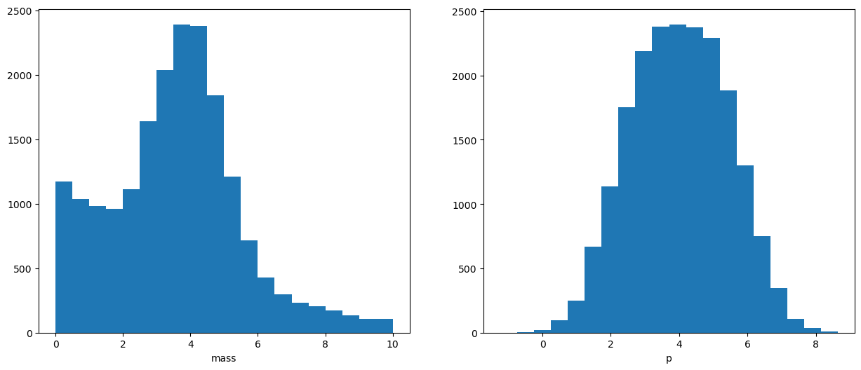
Of course we don’t have labels which events are signal and which are background beforehand
And we observe the mixture of two distributions:
[23]:
plt.figure(figsize=[15, 6])
mass = np.concatenate([sig_mass, bck_mass])
p = np.concatenate([sig_p, bck_p])

sorter = np.argsort(mass)
mass = mass[sorter]
p = p[sorter]

plt.subplot(121)
plt.hist(mass, bins=20, range=(0, 10))
plt.xlabel('mass')

plt.subplot(122)
plt.hist(p, bins=20)
plt.xlabel('p')
[23]:
Text(0.5, 0, 'p')
We have no information about real labels
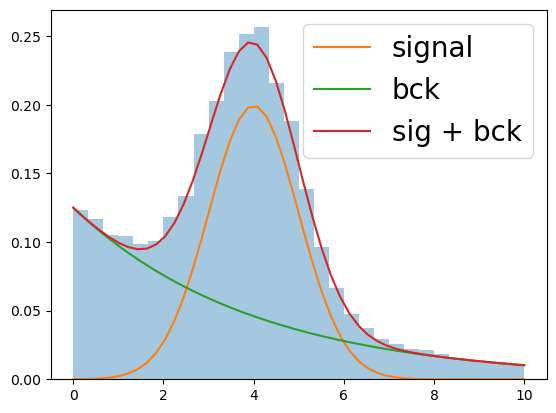
But we know a priori that background is distributed as exponential distribution and signal - as gaussian (more complex models can be met in practice, but idea is the same).
After fitting the mixture (let me skip this process), we will get the following result:
[24]:
x = np.linspace(0, 10)
plt.hist(mass, bins=30, range=[0, 10], density=True, alpha=0.4)
plt.plot(x, norm.pdf(x, loc=4, scale=1) / 2., label='signal')
plt.plot(x, expon.pdf(x, scale=4) / 2., label='bck')
plt.plot(x, 0.5 * (norm.pdf(x, loc=4, scale=1) + expon.pdf(x, scale=4)), label='sig + bck')
plt.legend(fontsize=20)
[24]:
<matplotlib.legend.Legend at 0x7f2e8dfabdd0>
Fitting doesn’t give us information about real labels
But it gives an information about probabilities, thus now we can estimate number of signal and background events within each bin.
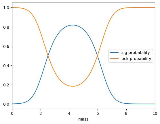
We won’t use bins, but instead we will get for each event probability that it is signal or background:
[25]:
import pandas

probs = pandas.DataFrame(dict(sig=sig_mass_distr.pdf(mass), bck=bck_mass_distr.pdf(mass)))
probs = probs.div(probs.sum(axis=1), axis=0)
[26]:
plt.plot(mass, probs.sig, label='sig probability')
plt.plot(mass, probs.bck, label='bck probability')
plt.xlim(0, 10), plt.legend(), plt.xlabel('mass')
[26]:
((0.0, 10.0),
 <matplotlib.legend.Legend at 0x7f2e90110590>,
 Text(0.5, 0, 'mass'))
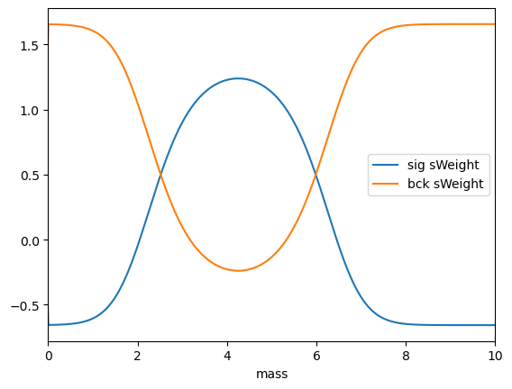
Appying sPlot
sPlot converts probabilities to sWeights, using an implementation from hep_ml:
[27]:
from hep_ml import splot

sWeights = splot.compute_sweights(probs)
As you can see, there are also negative sWeights, which are needed to compensate the contributions of other class.
[28]:
plt.plot(mass, sWeights.sig, label='sig sWeight')
plt.plot(mass, sWeights.bck, label='bck sWeight')
plt.xlim(0, 10), plt.legend(), plt.xlabel('mass');
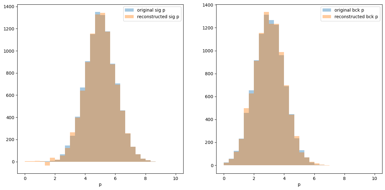
Using sWeights to reconstruct initial distribution
Let’s check that we achieved our goal and can reconstruct momentum distribution for signal and background:
[29]:
plt.figure(figsize=[15, 7])
plt.subplot(121)
hist_conf = dict(bins=30, alpha=0.4, range=[0, 10])
plt.hist(sig_p, label='original sig p', **hist_conf)
plt.hist(p, weights=sWeights.sig, label='reconstructed sig p', **hist_conf)
plt.xlabel('p'), plt.legend()

plt.subplot(122)
plt.hist(bck_p, label='original bck p', **hist_conf)
plt.hist(p, weights=sWeights.bck, label='reconstructed bck p', **hist_conf)
plt.xlabel('p'), plt.legend()
pass
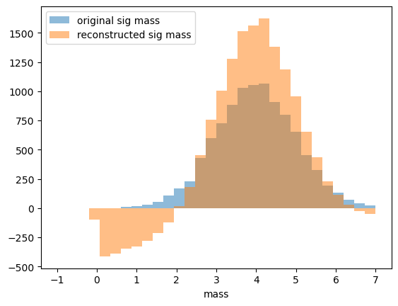
An important requirement of sPlot
Reconstructed variable (i.e. \(p\)) and splotted variable (i.e. mass) shall be statistically independent for each class.
Read the line above again. Reconstructed and splotted variable are correlated:
[30]:
np.corrcoef(abs(mass - 4), p) [0, 1]
[30]:
np.float64(-0.33863219046712434)
But within each class there is no correlation, so the requirement is satisfied:
[31]:
print(np.corrcoef(abs(sig_mass - 4), sig_p)[0, 1])
print(np.corrcoef(abs(bck_mass - 4), bck_p)[0, 1])
-0.012100405033912274
0.0035109881431928916
as a demonstration why this is important let’s use sweights to reconstruct mass (obviously mass is correlated with mass):
[32]:
hist_conf = dict(bins=30, alpha=0.5, range=[-1, 7])
plt.hist(sig_mass, label='original sig mass', **hist_conf)
plt.hist(mass, weights=sWeights.sig, label='reconstructed sig mass', **hist_conf)
plt.xlabel('mass'), plt.legend()
pass
\(\def\ps{p_s(x)}\) \(\def\pb{p_b(x)}\) \(\def\ws{sw_s(x)}\) \(\def\wb{sw_b(x)}\)
Derivation of sWeights (optional)
Now, after we seen how this works, let’s derive a formula for sWeights.
The only information we have from fitting over mass is $ \ps `$, $ :nbsphinx-math:pb`$ which are probabilities of event \(x\) to be signal and background.
Our main goal is to correctly reconstruct histogram. Let’s reconstruct the number of signal events in particular bin. Let’s introduce unknown \(p_s\) and \(p_b\) - probability that signal or background event will be in the named bin.
(Since mass and reconstructed variable are statistically independent for each class, \(p_s\) and \(p_b\) do not depend on mass.)
The mathematical expectation should be obviously equal to \(p_s N_s\), where \(N_s\) is total amount of signal events available from fitting.
Let’s also introduce random variable \(1_{x \in bin}\), which is 1 iff event \(x\) lies in selected bin.
The estimate for number of signal event in bin is equal to:
where \(\ws\) are sPlot weights and are subject to find.
This way we can guarantee that mean contribution of background are 0 (expectation is zero, but observed number will not be zero due to statistical deviation).
Under assumption of linearity:
assuming that splot weight can be computed as a linear combination of conditional probabilities:
$ \ws `= a_1 :nbsphinx-math:pb + a_2 :nbsphinx-math:ps`$
We can easily reconstruct those numbers, first let’s rewrite our system:
$ \sum_x (a_1 \pb `+ a_2 :nbsphinx-math:ps`) ; \ps `= 0$ $ :nbsphinx-math:sum`x (a_1 :nbsphinx-math:`pb `+ a_2 :nbsphinx-math:`ps`) ; :nbsphinx-math:`pb `= N{sig}$
$ a_1 V_{bb} + a_2 V_{bs} = 0$ $ a_1 V_{sb} + a_2 V_{ss} = N_{sig}$
Where $V_{ss} = \sum_x \ps `; :nbsphinx-math:ps $, :math:`V_{bs} = V_{sb} = sum_x ps ; pb, \(V_{bb} = \sum_x \pb \; \pb\)
Having solved this linear equation, we get needed coefficients (as those in the paper)
NB. There is little difference between \(V\) matrix I use and \(V\) matrix in the paper.
Minimization of variation
\(\def\Var{\mathbb{V}\,}\)
Previous part allows one to get the correct result. But there is still no explanation of reason for linearity.
Apart from having correct mean, we should also minimize variation of any reconstructed variable. Let’s try to optimize it
A bit complex, isn’t it? Instead of optimizing such a complex expression (which is individual for each bin), let’s minimize it’s uniform upper estimate
so if we are going to minimize this upper estimate, we should solve the following optimization problem with constraints: $:nbsphinx-math:sum_x \ws`^2 :nbsphinx-math:to :nbsphinx-math:min $ :math:sum_x ws ; pb = 0` \(\sum_x \ws \; \ps = N_{sig}\)
Let’s write lagrangian of optimization problem:
Conclusion
sPlot allows reconstruction of some variables.
the only information used is probabilities taken from fit over variable. If fact, any probability estimates fit well.
the source of probabilities should be statistically independent from reconstructed variable (for each class!).
mixture may contain more than 2 classes (this is supported by
hep_ml.splotas well)