Histograms
Overview
Teaching: 20 min
Exercises: 5 minQuestions
How do I make a histogram in Python (without ROOT)?
How can I change histogram settings?
Objectives
Create a histogram of an array (regular or jagged).
Make a histogram’s axes logarithmic.
Histogramming basics
Histograms are the most important type of plots for particle physics. We’ll need to know how to make them with the tools we have. Matplotlib is the standard and most popular plotting package for Python, and it is quite powerful, so we’ll use it. First we import it:
import matplotlib.pyplot as plt
(It’s customary to import it abbreviated as plt as above, which saves some typing.)
The histogram function in Matplotlib is hist().
We can see what it does by just passing it our nMuon branch:
plt.hist(branches['nMuon'])
(array([8.7359e+04, 1.2253e+04, 3.5600e+02, 2.8000e+01, 2.0000e+00,
        1.0000e+00, 0.0000e+00, 0.0000e+00, 0.0000e+00, 1.0000e+00]),
 array([ 0. ,  3.9,  7.8, 11.7, 15.6, 19.5, 23.4, 27.3, 31.2, 35.1, 39. ]),
 <a list of 10 Patch objects>)
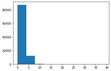
What’s with all the numbers above the plot?
hist()actually returns all the bin contents and bin edges in case you want to do something with them after creating the plot. We don’t need these return values, and they clutter up the notebook, so we should get rid of them. There are a few ways to do this, but I think the best practice is to addplt.show(), which is a way to tell Matplotlib when your plot is all set up and ready to be displayed. As a consequence ofhist()not being the last line in the notebook cell, the bin values will no longer be printed. For example:plt.hist(branches['nMuon']) plt.show()I’ll follow this convention from now on.
That created a histogram, but it’s not a very good one.
You can’t really understand much about the distribution because the binning and scale are too large.
These settings are controlled by the bins and range parameters:
plt.hist(branches['nMuon'], bins=10, range=(0, 10))
plt.show()
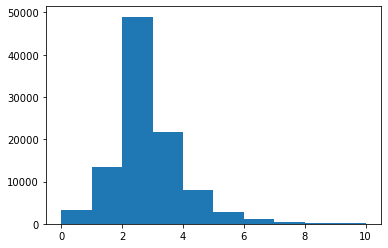
bins here is the total number of bins (of equal width), and range is a pair of numbers representing where the first bin starts and where the last bin ends.
Binning and range tips
Getting the binning and range right for a histogram is somewhat of an art, but I often find it helpful to know the mean, standard deviation, minimum, and maximum of the original distribution.
First, import NumPy via:
import numpy as npThen the following functions calculate these values for an array:
np.mean(branches['nMuon'])2.35286np.std(branches['nMuon'])1.19175912851549np.min(branches['nMuon'])0np.max(branches['nMuon'])39
Hmm, we’re still missing axis titles on the histogram.
(Always label your plots!)
We can do this with the xlabel() and ylabel() functions:
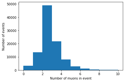
plt.hist(branches['nMuon'], bins=10, range=(0, 10))
plt.xlabel('Number of muons in event')
plt.ylabel('Number of events')
plt.show()
Histogramming a jagged array
We can make histograms of the other branches as well, but there’s one more step necessary because of their jaggedness. Matplotlib expects a series of data to be in a 1D array, so we need to convert or flatten the jagged 2D array into a 1D array. In order to do this, we need to import Awkward Array:
import awkward as ak
Then use ak.flatten() on the branch’s array:
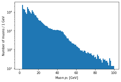
plt.hist(ak.flatten(branches['Muon_pt']), bins=100, range=(0, 100))
plt.xlabel('Muon $p_{\mathrm{T}}$ [GeV]')
plt.ylabel('Number of muons / 1 GeV')
plt.show()
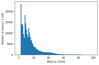
Note that you can use LaTeX in Matplotlib labels (as I did above).
Logarithmic scales
Another important thing to know is how to set axes to a logarithmic scale.
For the y-axis, this is as simple as adding a line with plt.yscale('log'):
plt.hist(ak.flatten(branches['Muon_pt']), bins=100, range=(0, 100))
plt.xlabel('Muon $p_{\mathrm{T}}$ [GeV]')
plt.ylabel('Number of muons / 1 GeV')
plt.yscale('log')
plt.show()
As you might guess, plt.xscale('log') will make the x-axis scale logarithmic.
The issue is that this doesn’t make the bin sizes logarithmic, so the plot will end up looking quite strange in most cases.
The solution to this is to use a NumPy function called logspace to calculate logarithmic bin edges:
import numpy as np
plt.hist(ak.flatten(branches['Muon_pt']), bins=np.logspace(np.log10(1), np.log10(100), 100))
plt.xlabel('Muon $p_{\mathrm{T}}$ [GeV]')
plt.xscale('log')
plt.ylabel('Number of muons')
plt.show()
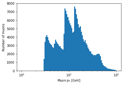
In the above example, bins is being set to an array.
If Matplotlib sees that bins is an array, it will use the values of the array to set the bin edges rather than try to evenly space them across range.
Don’t worry too much if this seems confusing; the details of how this works isn’t important for this lesson.
The important part is that, inside the logspace() call, you can modify the numbers to change where the bins start and end and how many bins there are.
Don’t remove the np.log10 part, though.
Exercise
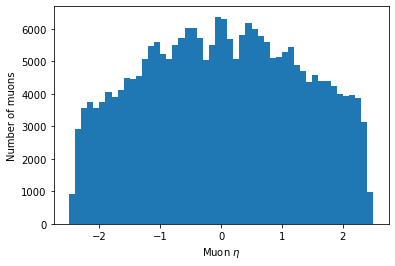
Make a histogram of the eta of all muons. Play around with the options described in this page to try to get a nice looking plot.
Solution
Your plot might look a bit different, but it’s fine as long as the binning is reasonable such that you can see the same distribution features.
plt.hist(ak.flatten(branches['Muon_eta']), bins=50, range=(-2.5, 2.5))
plt.xlabel('Muon $\eta$')
plt.ylabel('Number of muons')
plt.show()
Key Points
Use the
binsand/orrangeparameters to improve histogram binning.Make sure your axes are labeled.
Jagged arrays must be flattened before histogramming.