Introduction
Overview
Teaching: 60 min
Exercises: 30 minQuestions
Why to use Matplotlib for HEP?
What kind of plots can be done?
Objectives
Understand the basics of Matplotlib
Learn how to manipulate the elements of a plot
The example-based nature of Matplotlib documentation is GREAT.
Matplotlib is the standard when it comes to making plots in Python. It is versatile and allows for lots of functionality and different ways to produce many plots. We will be focusing on using matplotlib for High Energy Physics.
A simple example
As with any Python code it is always good practice to import the necessary libraries as a first step.
import matplotlib.pyplot as plt
Matplotlib graphs your data on Figures (i.e., windows, Jupyter widgets, etc.), each of which can contain one or more Axes (i.e., an area where points can be specified in terms of x-y coordinates, or theta-r in a polar plot, or x-y-z in a 3D plot, etc.). The simplest way of creating a figure with an Axes object is using pyplot.subplots. We can then use Axes.plot to draw some data on the axes:
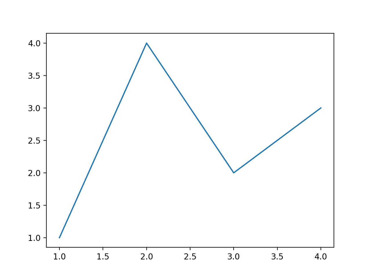
fig, ax = plt.subplots()  # Create a figure containing a single axes.
ax.plot([1, 2, 3, 4], [1, 4, 2, 3])  # Plot some data on the axes.
plt.show()  # Show the figure
This code produces the following figure:
Notice
If you look at the plot and the order of the list of numbers you can clearly see that the order of the arguments is of the form
ax.plot(xpoints,ypoints)But what is useful is that if we wanted to do more than one plot in the same figure we could do this in two main ways.
ax.plot(xpoints,ypoints , xpoints_2,ypoints_2, xpoints_3,ypoints_3)Or the more traditional way
ax.plot(xpoints,ypoints)
ax.plot(xpoints_2,ypoints_2)
ax.plot(xpoints_3,ypoints_3)
Both methods allow you to produce a plot like the following (we will later see how to produce them in more detail)
See example plot
What goes into a plot?
Now, let’s have a deeper look at the components of a Matplotlib figure.

How to work with some of these elements?
Note
We will be making the plot shown in the Notice above as an example and develop on top of it for each element we will be showing. This will be done gradually such to only need to add the lines shown in the code.
For the following example you will need these lines as a starting point.
import matplotlib.pyplot as plt
import numpy as np
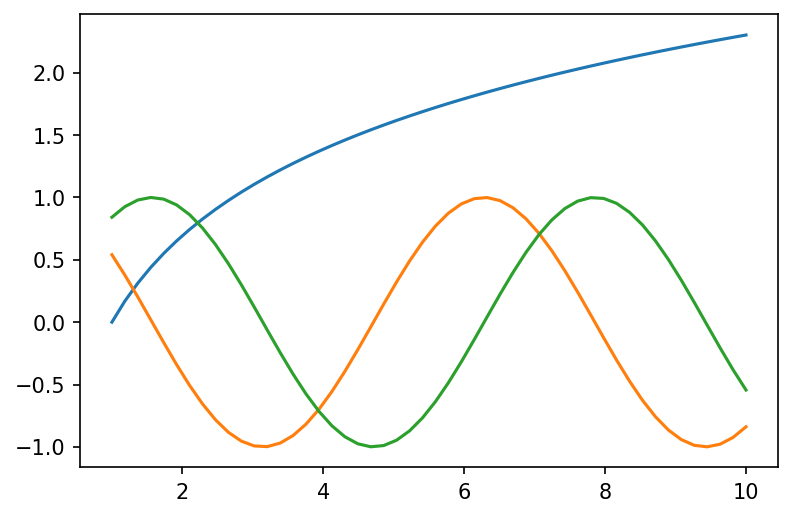
# generate data points
x1 = np.linspace(1, 10)
y1, y2, y3 = np.log(x1), np.cos(x1), np.sin(x1)
# plotting
fig, ax = plt.subplots()
ax.plot(x1, y1)
ax.plot(x1, y2)
ax.plot(x1, y3)
plt.show()
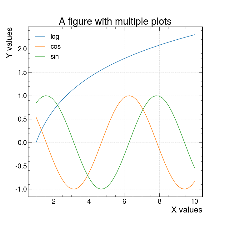
Axes Labels
In order to produce axes labels in matplotlib one uses the self descriptive command set_xlabel or set_ylabel like so
fig, ax = plt.subplots()
ax.set_xlabel("X values")
ax.set_ylabel("Y values")
One can also control the size and rotation of the text by adding the keyword arguments size = 15, rotation = 45
An important detail is that when you want to do changes and show them in your plot you must apply these changes between the ax.plot and plt.show() commands.
Why? These commands act on the canvas that is currently being drawn, so it should make sense that one has to first create the canvas with the plot with ax.plot() and apply changes afterwards.
When you are done with it, only then you may use the plt.show() as this will dump to the screen all changes applied. Any command used after plt.show() will return an error since matplotlib does not know what is the canvas to be worked on.
Legend
There are different ways to create a legend in matplotlib but the easiest one to use would be to pass the keyword argument label inside the ax.plot() and use the ax.legend() command to automatically detect and show the individual labels on the canvas
fig, ax = plt.subplots()
ax.plot(x1, y1, label="log")
ax.plot(x1, y2, label="cos")
ax.plot(x1, y3, label="sin")
ax.legend()
plt.show()
The Figure (resize and set the resolution)
As mentioned, by default fig, ax = plt.subplots() creates the canvas automatically. We can have finer control over the shape and quality of the plots by using the keyword arguments figsize and dpi as follows.
fig, ax = plt.subplots(figsize=(10, 10), dpi=150)
This has to be set before any instance of ax.plot and it sets the width and height to 10 and 10 inches respectively. The keyword dpi refers to a density of Dots Per Inch.
There is no particular reason to choose 150 as the value for dpi but there is a visually a noticeable difference in the size and quality of the plot.
Title
The title of a plot is placed at the top of the figure with the command ax.set_title
ax.set_title("A figure with multiple lines")
We can control the font size of the labels, the title and any text by passing the fontsize argument and giving any integer. This will determine the size in points.
Grid
Now lets add a grid with ax.grid. This is self explanatory.
ax.grid()
Another nice thing is that we can add the alpha argument to make the lines of the grid more or less “see through”. This can also be done lines, dots, shades, and almost anything else that has color.
Ticks
By default python will drop some ticks on the y and x axis but we can have control over them with the arguments
ticks: When this argument is specified with an array-like object, you can control the location of the ticks to show. For example :
ax.set_yticks((1, 2, 5, 6, 7))
Will only show the numbers [1,2,5,6,7] in their proper location.
labels: This can only be used ifticksis also specified. This will be the physical text shown on each of the locations specified byticks. For example:
ax.set_yticks(
    ticks=[1, 2, 5, 6, 7], labels=["One", 2, "Five", "Then sixth", "The Last"]
)
Will show each of the specified labels in the locations as specified by ticks
size: This argument accepts integer values to controls the fontsize of the tick labels.
Linestyles and markers
The basic ax.plot uses lines by default, but we can specify what to use as a marker or the linestyle for each line. Here is a table with the different options available
| character | description | character | description | character | color |
|---|---|---|---|---|---|
| ’.’ | point marker | ’-‘ | solid line style | ‘b’ | blue |
| ’,’ | pixel marker | ’–’ | dashed line style | ‘g’ | green |
| ‘o’ | circle marker | ’-.’ | dash-dot line style | ‘r’ | red |
| ‘v’ | triangle_down marker | ’:’ | dotted line style | ‘c’ | cyan |
| ’^’ | triangle_up marker | ‘m’ | magenta | ||
| ’<’ | triangle_left marker | ‘y’ | yellow | ||
| ’>’ | triangle_right marker | ‘k’ | black | ||
| ‘1’ | tri_down marker | ‘w’ | white |
For further examples, see the matplotlib docs Linestyles and Markers
Here are a few example for combinations of these.
'b'    # blue markers with default shape
'or'   # red circles
'-g'   # green solid line
'--'   # dashed line with default color
'^k:'  # black triangle_up markers connected by a dotted line
Exercise:
Exercise: Using the table above, plot functions using different linestyles/markers on the same canvas:
Solution
x1 = np.linspace(1, 10)
y1, y2, y3 = np.log(x1), np.cos(x1), np.sin(x1)
fig, ax = plt.subplots()  # Create a figure containing a single axes.
ax.plot(x1, y1, linestyle="--", label="Dashed line")
ax.plot(x1, y2, linestyle=":", label="Dotted line style")
ax.plot(x1, y3, marker="o", label="Circle marker")
ax.legend()
fig.show()
With HEP styling
We have available a useful python package called mplhep which is a matplotlib wrapper for easy plotting required in high energy physics (HEP). Primarily “prebinned” 1D & 2D histograms and matplotlib style-sheets carrying recommended plotting styles of large LHC experiments - ATLAS, CMS & LHCb. This project is published on GitHub as part of the scikit-hep toolkit.
Usage
import mplhep as hep

hep.style.use(hep.style.ROOT)  # For now ROOT defaults to CMS
# Or choose one of the experiment styles
hep.style.use(hep.style.ATLAS)
# or
hep.style.use("CMS")  # string aliases work too
# {"ALICE" | "ATLAS" | "CMS" | "LHCb1" | "LHCb2"}
and with just this addition we can produce the same plot as before with this new look.
Warning
After you import and set the styling with
hep.style.use("CMS")all the plots made afterwards will have this styling implemented. To get back the default styling doimport matplotlib matplotlib.style.use('default')
Other types of plots
With matplotlib, there is no shortage of the kinds of plots to work with. Here we have only used line plots as a baseline to learn what things we can do. There are scatter plots, bar plots, stem plots and pie charts. You can also visualize images, vector fields and much more!
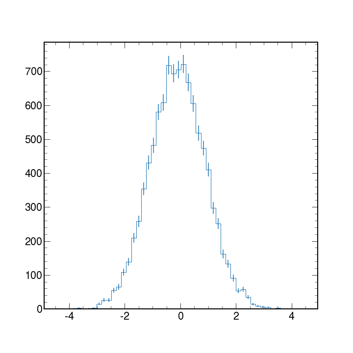
In High Energy Physics, we typically work with binned data and produce histograms. Histograms are used mainly to tell us how things are distributed rather than a relationship between 2 variables.
Matplotlib can take an array of data and with the hist python will bin the data to create histograms.
We will discuss histograms more in detail later but here is an example code and plot of a generic histogram with errorbars applied.
# first lets get some fake data
data = np.random.normal(size=10_000)

# now lets make the plot
counts, bin_edges, _ = ax.hist(data, bins=50, histtype="step")

# we need to get the centers in order get the correct location for the errobars
bin_centers = bin_edges[:-1] + np.diff(bin_edges) / 2

# add error bars
ax.errorbar(bin_centers, counts, yerr=np.sqrt(counts), fmt="none")
plt.show()
More information?
If you want to know what other parameters are available for the plot function, or want to learn about other types of plots, visit the Matplotlib documentation page.
You can also use the built-in python functions dir(obj) and help(obj) for information on the methods and immediate documentation of the python objects given as an argument.
Note
Matplotlib also has some cheatsheets and handouts which might be useful for quick reference!
Key Points
Matplotlib graphs data in Figures, each of which can contain components that can be manipulated: axis, legend, labels, etc.
Many kinds of plots can be produced: scatter plots, bar plots, pie charts, and many more
HEP styling is available via the
mplheppackage, with recommended plotting styles from LHC experimentsMatplotlib can take objects containing data and bin them to produce histograms (which are very common in HEP)
Check the Matplotlib documentation for getting details on all the available options
Coffee break
Overview
Teaching: 0 min
Exercises: 15 minQuestions
Coffee or tea?
Objectives
Refresh your mental faculties with coffee and conversation


The Coffee break page is inspired from the HSF Introduction to Docker lesson!
Key Points
Physics background
Overview
Teaching: 30 min
Exercises: 0 minQuestions
What is the physics behind the data?
Objectives
Learn the basics of the physics processes present in the data
You can take a look at the mathematical structure of the Standard Model of Particle Physics in the next section, or go directly to the main Higgs production mechanisms at hadron colliders.
The Standard Model of Particle Physics
The Standard Model Lagrangian
The SM is a quantum field theory that is based on the gauge symmetry \(SU(3)_{C}\times SU(2)_{L}\times U(1)_{Y}\). This gauge group includes the symmetry group of the strong interactions, \(SU(3)_{C}\), and the symmetry group of the electroweak (EW) interactions, \(SU(2)_{L}\times U(1)_{Y}\).
The strong interaction part, quantum chromodynamics (QCD) is an SU(3) gauge theory described by the lagrangian density
\({\cal{L}}_{SU(3)}=-\frac{1}{4}G_{\mu\nu}^{a}G_{a}^{\mu\nu}+\sum_{r}\overline{q}_{r\alpha}iD_{\mu\beta}^{\alpha}\gamma^{\mu}q_{r}^{\beta}\),
where \(G_{\mu\nu}^{a}=\partial_{\mu}G_{\nu}^{a}-\partial_{\nu}G_{\mu}^{a}+g_{s}f^{abc}G_{\mu}^{b}G_{\nu}^{c}\) is the field strength tensor for the gluon fields \(G_{\mu}^{a}\), \(a=1,\dots,8\), and the structure constants \(f^{abc}\) \((a,b,c=1,\dots,8)\) are defined by \([T^{a},T^{b}]=if^{abc}T_{c}\).
The second term in \({\cal{L}}_{SU(3)}\) is the gauge covariant derivative for the quarks: \(q_{r}\) is the \(r^{th}\) quark flavor, \(\alpha\),\(\beta=1,2,3\) are color indices, and
\(D_{\mu\beta}^{\alpha}=(D_{\mu})_{\alpha\beta}=\partial_{\mu}\delta_{\alpha\beta}-ig_{s}T_{a\alpha\beta}G_{\mu}^{a}\).
The EW theory is based on the \(SU(2)_{L}\times U(1)_{Y}\) lagrangian density \({\cal{L}}_{SU(2)\times U(1)}={\cal{L}}_{fermions}+{\cal{L}}_{gauge}+{\cal{L}}_{Scalar}+{\cal{L}}_{Yuk}\), where
\({\cal{L}}_{fermions}=\overline{L}_{i}iD_{\mu}\gamma^{\mu}L_{i}+\overline{e}_{Ri}iD_{\mu}\gamma^{\mu}e_{Ri}+\overline{Q}_{i}iD_{\mu}\gamma^{\mu}Q_{i}+\overline{u}_{Ri}iD_{\mu}\gamma^{\mu}u_{Ri}+\overline{d}_{Ri}iD_{\mu}\gamma^{\mu}d_{Ri}\),
and where \(D_{\mu}=\partial_{\mu}-ig_{2}T_{a}W_{\mu}^{a}-ig_{1}\frac{Y_{q}}{2}B_{\mu}\).
The gauge part is
\({\cal{L}}_{gauge}=-\frac{1}{4}W_{\mu\nu}^{a}W_{a}^{\mu\nu}-\frac{1}{4}B_{\mu\nu}B^{\mu\nu}\),
where \(W_{\mu\nu}^{a}=\partial_{\mu}W_{\nu}^{a}-\partial_{\nu}W_{\mu}^{a}+g_{2}\epsilon^{abc}W_{\mu}^{b}W_{\nu}^{c}\) and \(B_{\mu\nu}=\partial_{\mu}B_{\nu}-\partial_{\nu}B_{\mu}\) are the field strength tensors for the \(SU(2)\) and \(U(1)\) gauge fields, respectively.
The scalar part of the lagrangian is
\({\cal{L}}_{Scalar}=(D^{\mu}\Phi)^{\dagger}(D_{\mu}\Phi)-V(\Phi^{\dagger}\Phi)\),
where \(V(\Phi^{\dagger}\Phi)=\mu^{2}\Phi^{\dagger}\Phi+\lambda(\Phi^{\dagger}\Phi)^{2}\).
The Yukawa Lagrangian is
\({\cal{L}_{Yuk}}=-\lambda_{e}\overline{L}\Phi e_{R}-\lambda_{d}\overline{Q}\Phi d_{R}-\lambda_{u}\overline{Q}\tilde\Phi u_{R}+h.c.\).
Spontaneous Symmetry Breaking and Mass Generation: The Higgs Mechanism in the SM
Experimentally, the weak bosons are massive. We give mass to the gauge bosons through the Higgs Mechanism: generate mass terms from the kinetic energy term of a scalar doublet field \({\Phi}\) that undergoes spontaneous symmetry breaking.
Introduce a complex \(SU(2)\) doublet of scalar fields
\(\Phi = \begin{pmatrix} \phi^{+}\\ \phi^{0} \end{pmatrix}, Y_{\Phi}=+1\),
in the scalar lagrangian
\({\cal{L}}_{Scalar}=(D^{\mu}\Phi)^{\dagger}(D_{\mu}\Phi)-V(\Phi^{\dagger}\Phi)\),
where
\({D_{\mu}=\partial_{\mu}-ig_{s}T_{a}G_{\mu}^{a}-ig_{2}T_{a}W^{a}_{\mu}-ig_{1}\frac{Y_{q}}{2}B_{\mu}}\),
and
\(V(\Phi^{\dagger}\Phi)={\mu^{2}}\Phi^{\dagger}\Phi+{\lambda}(\Phi^{\dagger}\Phi)^{2}\).
For \(\mu^{2}<0\), the neutral component of \(\Phi\) will develop a vev
\(< \Phi >_{0}\equiv <0|\Phi|0>=\) \(\begin{pmatrix} 0\\ \frac{\upsilon}{\sqrt{2}} \end{pmatrix}\),
with \(\upsilon=\bigg{(}-\frac{\mu^{2}}{\lambda}\bigg{)}^{1/2}\).
Writing the field \(\Phi\) in terms of four fields \(\phi_{1,2,3}(x)\) and \(H(x)\) at first order and expanding it around the minimum
\(\Phi =\) \(\begin{pmatrix} \phi^{+}\\ \phi^{0} \end{pmatrix} =\) \(\begin{pmatrix} \phi_{2}+i\phi_{1}\\ \frac{1}{2}({\upsilon}+{H})-i\phi_{3} \end{pmatrix} =\) \(exp\bigg{[}\frac{i\phi_{a}(x)\tau^{a}(x)}{\upsilon}\bigg{]} \begin{pmatrix} 0\\ \frac{1}{2}(\upsilon+{H(x)}) \end{pmatrix}\).
We can rotate away the fields \(\phi_{a}(x)\) by an \(SU(2)_{L}\) gauge transformation
\(\Phi(x)\rightarrow\Phi'(x)=U(x)\Phi(x)=\frac{1}{\sqrt{2}}\) \(\begin{pmatrix} 0\\ {\upsilon} +{H(x)} \end{pmatrix}\),
where
\(U(x)=exp\bigg{[}-i\phi_{a}\tau^{a}(x)\bigg{]}\).
This gauge choice, called unitary gauge, is equivalent to absorbing the Goldstone modes \(\phi_{a}(x)\).
Then we can fully expand the term \((D_{\mu}\Phi)^{2}\) of the lagrangian \({\cal{L}}_{Scalar}\):
\(|D_{\mu}\Phi|^{2}=\frac{1}{2}(\partial_{\mu}H)^{2}+\frac{1}{8}g_{2}^{2}(\upsilon+H)^{2}|W_{\mu}^{1}+iW_{\mu}^{2}|^{2}+\frac{1}{8}(\upsilon+H)^{2}|g_{2}W_{\mu}^{3}-g_{1}B_{\mu}|^{2}\).
We now define the new fields \(W_{\mu}^{\pm}\) and \(Z_{\mu}\) (\(A_{\mu}\) is the field orthogonal to \(Z_{\mu}\)):
\(W^{\pm}=\frac{1}{\sqrt{2}}(W_{\mu}^{1}\mp iW_{\mu}^{2}),Z_{\mu}=\frac{g_{2}W_{\mu}^{3}-g_{1}B_{\mu}}{\sqrt{g_{2}^{2}+g_{1}^{2}}},A_{\mu}=\frac{g_{2}W_{\mu}^{3}+g_{1}B_{\mu}}{\sqrt{g_{2}^{2}+g_{1}^{2}}}\).
We can pick up the terms which are bilinear in the fields \(W^{\pm}\), \(Z\), \(A\):
\(M_{W}^{2}{W_{\mu}^{+}W^{-\mu}}+\frac{1}{2}M_{Z}^{2}{Z_{\mu}Z^{\mu}}+\frac{1}{2}M_{A}^{2}{A_{\mu}A^{\mu}}\).
The \(W\) and \(Z\) bosons have acquired masses, while the photon remains massless
\(M_{W}=\frac{1}{2}\upsilon g_{2}, M_{Z}=\frac{1}{2}\upsilon\sqrt{g_{2}^{2}+g_{1}^{2}}, M_{A}=0\).
Fermion Masses
We can use the same scalar field \(\Phi\) to generate the fermion masses, with \(Y=+1\), and the isodoublet \(\tilde\Phi=i\tau_{2}\Phi^{\star}\), with \(Y=-1\). For any fermion generation, we introduce the \(SU(2)_{L}\times U(1)_{Y}\) invariant Yukawa lagrangian
\({\cal{L}}_{Yuk}=-\lambda_{e}\overline{L}\Phi e_{R}-\lambda_{d}\overline{Q}\Phi d_{R}-\lambda_{u}\overline{Q}\tilde\Phi u_{R}+h.c.\),
and repeat the same procedure as above. Taking for instance only the electron, we get
\({\cal{L}}_{Yuk}=-\frac{1}{\sqrt{2}} \begin{pmatrix} \overline{\nu}_{e} & \overline{e}_{L} \end{pmatrix} \begin{pmatrix} 0\\ \upsilon+H \end{pmatrix}e_{R}+... =-\frac{1}{\sqrt{2}}\lambda_{e}(\upsilon+H)\overline{e}_{L}e_{R}+...\).
The constant term in front of \(\overline{f}_{L}f_{R}\) (and h.c.) is identified with the fermion mass
\(m_{e}=\frac{\lambda_{e}\upsilon}{\sqrt{2}},m_{u}=\frac{\lambda_{u}\upsilon}{\sqrt{2}},m_{d}=\frac{\lambda_{d}\upsilon}{\sqrt{2}}\).
The Higgs Particle in the SM
The kinetic part of the Higgs field, \(\frac{1}{2}(\partial_{\mu}{H})^{2}\), comes from the term involving the covariant derivative \((D_{\mu}\Phi)^{2}\), while the mass and self-interaction parts, come from the scalar potential
\(V(\Phi)={\mu^{2}}\Phi^{\dagger}\Phi+{\lambda}(\Phi^{\dagger}\Phi)^{2}\) \(=\frac{\mu^{2}}{2} \begin{pmatrix} 0 & \upsilon+H \end{pmatrix} \begin{pmatrix} 0\\ \upsilon+H \end{pmatrix} +\frac{\lambda}{4}\bigg{|} \begin{pmatrix} 0 & \upsilon+H \end{pmatrix}\) \(\begin{pmatrix} 0\\ \upsilon+H \end{pmatrix} \bigg{|}^{2}\).
Using the relation \(\upsilon^{2}=-\mu^{2}/\lambda\), we get
\(V=-\frac{1}{2}\lambda{\upsilon^{2}}(\upsilon+H)^{2}+\frac{1}{4}\lambda(\upsilon+H)^{4}\).
The lagrangian containing the Higgs field H is given by
\({\cal{L}}_{H}=\frac{1}{2}(\partial_{\mu}{H})(\partial^{\mu}{H})-V\),
\({\cal{L}}_{H}=\frac{1}{2}(\partial^{\mu}{H})^{2}-\lambda{\upsilon^{2}}{H^{2}}-\lambda\upsilon {H^{3}}-\frac{\lambda}{4}{H^{4}}\).
From this Lagrangian, we have that the Higgs boson mass is given by
\(m_{H}^{2}=2\lambda{\upsilon^{2}}=-2\mu^{2}\),
and the Feynman rules for the Higgs self-interaction vertices are given by
\(g_{HHH}=(3!)i\lambda\upsilon=3i\frac{m_{H}^{2}}{\upsilon}, g_{HHHH}=(4!)i\frac{\lambda}{4}=3i\frac{m_{H}^{2}}{\upsilon^{2}}\).
As for the Higgs boson couplings to gauge bosons and fermions
\({\cal{L}}_{M_{V}}\sim M_{V}^{2}\bigg{(}1+\frac{H}{\upsilon}\bigg{)}^{2}\),
\({\cal{L}}_{m_{f}}\sim -m_{f}\bigg{(}1+\frac{H}{\upsilon}\bigg{)}\),
we get
\(g_{Hff}=i\frac{m_{f}}{\upsilon}, g_{HVV}=-2i\frac{M_{V}^{2}}{\upsilon}, g_{HHVV}=-2i\frac{M_{V}^{2}}{\upsilon^{2}}\).
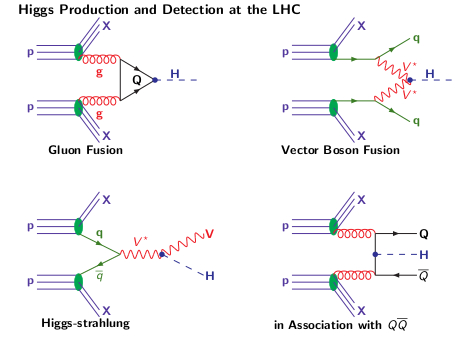
Higgs Production Mechanisms at Hadron Colliders
The four main Higgs production mechanisms at a hadron collider are
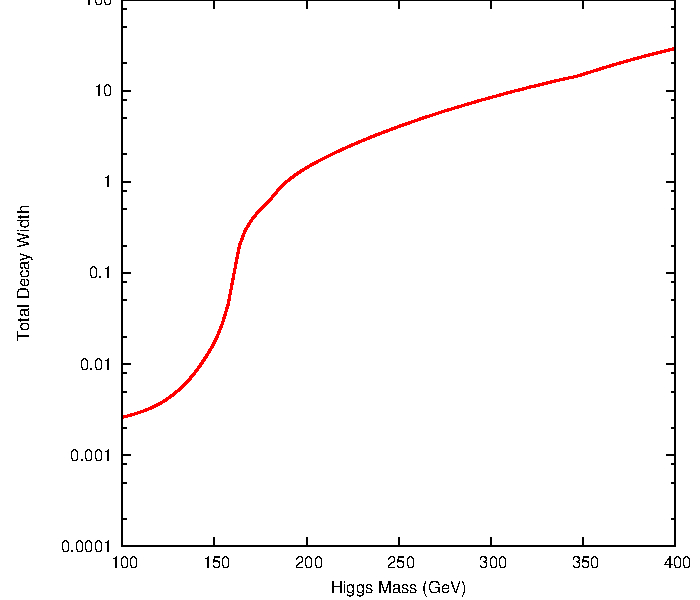
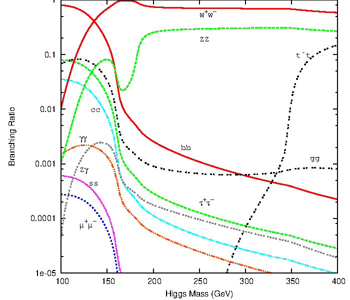
The Higgs boson can decay into fermions and bosons, the total decay width and the branching ratios in function of the Higgs mass are shown below
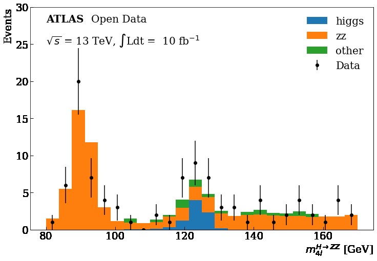
Higgs boson decay into four leptons
We are going to focus on the data obtained at the ATLAS and CMS detectors at the LHC for the Vector Boson Fusion production mechanism and its subsequent decay into four leptons in order to get this plot using Matplotlib
Key Points
Analysis studies Higgs boson decays
Higgs search
Overview
Teaching: 45 min
Exercises: 15 minQuestions
Why do we need to explore Data vs. MC distributions?
Objectives
Basic data exploration.
Apply a basic selection criteria.
Do some stacked plots with MC.
Add error bars to the plot.
Perform a Data vs. MC plot comparison.
In this episode, we will go through a first HEP analysis where you will be able to apply your knowledge of matplotlib and learn something new.
As we mentioned before, the goal is to reveal the decay of the Standard Model Higgs boson to two Z bosons and subsequently to four leptons
(H->ZZ->llll), this is called as a “golden channel”.
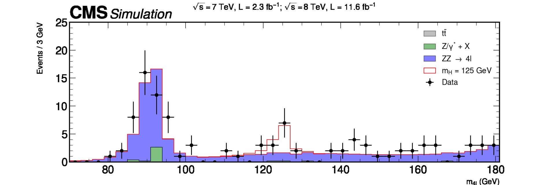
For this tutorial, we will use the ATLAS data collected during 2016 at a center-of-mass energy of 13 TeV, equivalent to 10fb⁻¹ of integrated luminosity. Here, we will use the available 4 leptons final state samples for simulated samples (Monte Carlo “MC”) and data, that after a selection, we will reveal a narrow invariant mass peak at 125 GeV, the Higgs.
First we need to import numpy and the matplotlib.pyplot module under the name plt, as usual:
import matplotlib as mpl
import matplotlib.pyplot as plt
import numpy as np
%matplotlib inline
Auto-show in jupyter notebooks
The jupyter backends (activated via
%matplotlib inline,%matplotlib notebook, or%matplotlib widget), call show() at the end of every cell by default. Thus, you usually don’t have to call it explicitly there.
Samples
In the following dictionary, we have classified the samples we will work on, starting with the “data” samples, followed by the “higgs” MC samples and at the end the “zz” and “others” MC background components.
samples_dic = {
    "data": [
        ["data", "data_A"],
        ["data", "data_B"],
        ["data", "data_C"],
        ["data", "data_D"],
    ],
    "higgs": [
        ["mc", "mc_345060.ggH125_ZZ4lep"],
        ["mc", "mc_344235.VBFH125_ZZ4lep"],
    ],
    "zz": [
        ["mc", "mc_363490.llll"],
    ],
    "other": [
        ["mc", "mc_361106.Zee"],
        ["mc", "mc_361107.Zmumu"],
    ],
}
We will use uproot to read the content of our samples that are in ROOT format.
import uproot
Uproot tutorial
If you want to learn more of the Uproot python Module you can take a look to the tutorial also given by the HEP software foundation in the following link.
For each sample of the above samples_dic, we will return another dictionary that will contain all the “branches” or “variables””.
processes = samples_dic.keys()
Tuples = {}
samples = []
for p in processes:
    for d in samples_dic[p]:
        # Load the dataframes
        sample = d[1]  # Sample name
        samples.append(sample)
        DataUproot = uproot.open(
            f"./data-ep04-higgs-search/OpenData_Atlas_{sample}.root"
        )
        Tuples[sample] = DataUproot["myTree"]
Let’s take a look to the “branches” stored in out data samples, taking “data_A” as example
list(Tuples["data_A"].keys())
['lep_n',
 'goodlep_pt_2',
 'trigM',
 'm4l',
 'weight',
 'lep_charge',
 'sum_good_lep',
 'trigE',
 'goodlep_pt_0',
 'goodlep_pt_1',
 'goodlep_sumtypes',
 'lep_type',
 'channelNumber',
 'lep_pt',
 'good_lep',
 'XSection',
 'lep_E',
 'sum_lep_charge']
Let’s access one of these “branches” and make a simple plot:
branches = {}
for s in samples:
    branches[s] = Tuples[s].arrays()
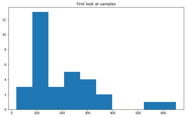
Using the pyplot hist function we can visualize the distribution the mass of the 4 leptons “m4l” for example for the “data_A” sample.
fig, ax = plt.subplots()
ax.set_title("First look at samples")
ax.hist(branches["data_A"]["m4l"])
(array([ 3., 13.,  3.,  5.,  4.,  2.,  0.,  0.,  1.,  1.]),
 array([ 19.312525,  82.30848 , 145.30444 , 208.3004  , 271.29636 ,
        334.2923  , 397.28827 , 460.2842  , 523.28015 , 586.2761  ,
        649.2721  ], dtype=float32),
 <BarContainer object of 10 artists>)
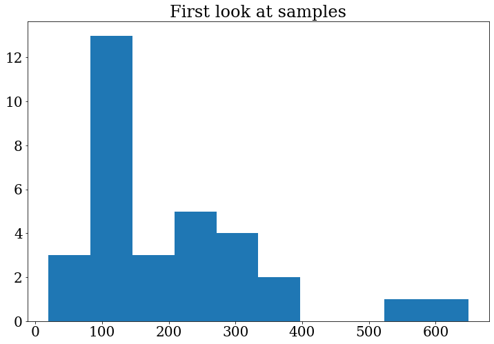
Tip: In the previous plot the numbers in the axis are very small, we can change the font size (and font family) for all the following plots, including in our code:
# Update the matplotlib configuration parameters:
mpl.rcParams.update({"font.size": 16, "font.family": "serif"})
Note that this changes the global setting, but it can still be overwritten later.
Let’s do the plot again to see the changes:
fig, ax = plt.subplots()
ax.set_title("First look at samples")
ax.hist(branches["data_A"]["m4l"])
(array([ 3., 13.,  3.,  5.,  4.,  2.,  0.,  0.,  1.,  1.]),
 array([ 19.312525,  82.30848 , 145.30444 , 208.3004  , 271.29636 ,
        334.2923  , 397.28827 , 460.2842  , 523.28015 , 586.2761  ,
        649.2721  ], dtype=float32),
 <BarContainer object of 10 artists>)
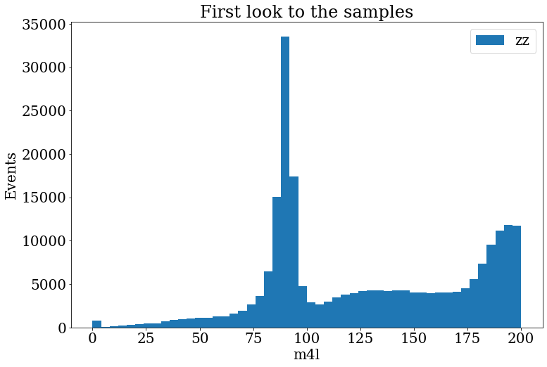
Exercise
Make the histogram of the variable
m4lfor samplemc_363490.llll.In the range
[0,200].With
bins=50.Include a legend “llll”.
Include the axis labels “Events” and “m4l”, in the axis y and x, respectively.
Solution
fig, ax = plt.subplots()
fig.set_size_inches((12, 8))
ax.set_title("First look to the samples")
ax.hist(branches["mc_363490.llll"]["m4l"], label="zz", range=[0, 200], bins=50)
ax.set_xlabel("m4l")
ax.set_ylabel("Events")
ax.legend()
Selection criteria
It is very important to include some selection criteria in our samples MC and data that we are analyzing. These selections are commonly know as “cuts”. With these cuts we are able to select only events of our interest, this is, we will have a subset of our original samples and the distribution are going to change after this cuts. This will help out to do some physics analysis and start to search for the physics process in which we are interested. In this case is the 4 lepton final state.
To do this, we will select all events, from all the samples, that satisfy the following criteria:
- the leptons need to activate either the muon or electron trigger,
- number of leptons in the final state should be 4,
- the total net charge should be zero,
- the sum of the types (11:e, 13:mu) can be 44 (eeee), 52 (mumumumu) or 48 (eemumu),
- good leptons with high transverse momentum
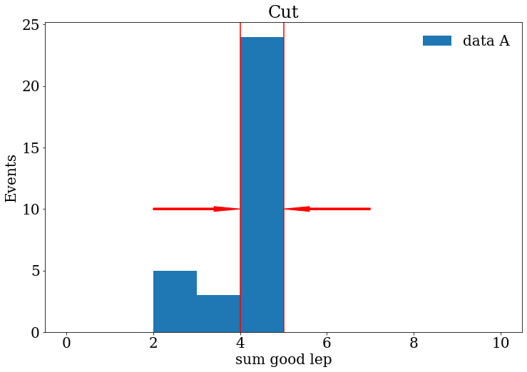
Let’s visualize some of these requirements. For now, let us continue working with the “data_A” sample. We can see how many good leptons we have in the event, by printing:
branches["data_A"]["good_lep"]
<Array [[1, 1, 1, 1], [1, ... 1], [1, 0, 1, 1]] type='32 * var * int32'>
From the previous output, we can notice that not all events have 4 good leptons. Therefore, we can use the sum of the number of good leptons per event. This variable is stored as “sum_good_lep”.
branches["data_A"]["sum_good_lep"]
<Array [4, 4, 3, 4, 4, 4, ... 4, 4, 2, 2, 4, 3] type='32 * int32'>
We will keep the events with “sum_good_lep”==4 (this is the topology we are looking for).
branches["data_A"]["sum_good_lep"] == 4
<Array [True, True, False, ... True, False] type='32 * bool'>
We can save this array in a variable to use later in a more complicated combination of requirements using the &, | and ~ logical operators.
sum_leptons_test = branches["data_A"]["sum_good_lep"] == 4
We certainly can visualize this information with Matplotlib making a histogram :).
Exercise
Make a histogram of the variable “sum_good_lep” for the sample “data_A” or another sample.
Try to represent in your histogram what are the events that we wanted to keep using lines, arrows or text in your plot.
Solution
fig, ax = plt.subplots()
fig.set_size_inches((12, 8))
ax.set_title("Cut")
ax.hist(branches["data_A"]["sum_good_lep"], range=[0, 10], bins=10, label="data A")
ax.arrow(2, 10, 2, 0,width=0.15, head_width=0.4, length_includes_head=True, color="red")
ax.arrow(7, 10, -2, 0,width=0.15, head_width=0.4, length_includes_head=True, color="red")
ax.axvline(x=4, color="red")
ax.axvline(x=5, color="red")
ax.set_xlabel("sum good lep")
ax.set_ylabel("Events")
ax.legend(frameon=False)
Finally, let’s save in a dictionary for all the samples the requirements mentioned above as follows:
selection_events = {}
for s in samples:
    trigger = (branches[s]["trigM"] == True) | (branches[s]["trigE"] == True)
    sum_leptons = branches[s]["sum_good_lep"] == 4
    sum_charge = branches[s]["sum_lep_charge"] == 0
    sum_types_ee = branches[s]["goodlep_sumtypes"] == 44
    sum_types_mm = branches[s]["goodlep_sumtypes"] == 52
    sum_types_em = branches[s]["goodlep_sumtypes"] == 48
    sum_types_goodlep = sum_types_ee | sum_types_mm | sum_types_em
    sum_lep_selection = sum_leptons & sum_charge & sum_types_goodlep
    # Select good leptons with high transverse momentum
    pt_0_selection = branches[s]["goodlep_pt_0"] > 25000
    pt_1_selection = branches[s]["goodlep_pt_1"] > 15000
    pt_2_selection = branches[s]["goodlep_pt_2"] > 10000
    high_pt_selection = pt_0_selection & pt_1_selection & pt_2_selection
    final_selection = (
        trigger & sum_types_goodlep & sum_lep_selection & high_pt_selection
    )
    selection_events[s] = final_selection
Moreover, we can compare, by printing, the number of initial and final events after the previous selection .
for s in samples:
    print(f"{s}       Initial events:  {len(branches[s]['m4l']):,}")
data_A       Initial events:  32
data_B       Initial events:  108
data_C       Initial events:  174
data_D       Initial events:  277
mc_345060.ggH125_ZZ4lep       Initial events:  163,316
mc_344235.VBFH125_ZZ4lep       Initial events:  189,542
mc_363490.llll       Initial events:  547,603
mc_361106.Zee       Initial events:  244
mc_361107.Zmumu       Initial events:  148
for s in samples:
    print(
        f"{s}       After selection:  {len(branches[s]['m4l'][selection_events[s]]):,}"
    )
data_A       After selection:  18
data_B       After selection:  52
data_C       After selection:  93
data_D       After selection:  158
mc_345060.ggH125_ZZ4lep       After selection:  141,559
mc_344235.VBFH125_ZZ4lep       After selection:  161,087
mc_363490.llll       After selection:  454,699
mc_361106.Zee       After selection:  27
mc_361107.Zmumu       After selection:  16
Notice that the background events are reduced meanwhile we try to keep most of the signal.
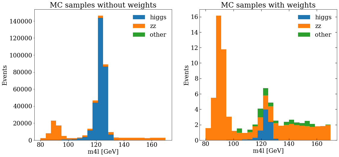
MC samples
To make a plot with all the MC samples we will do a stack plot. We will merge the samples following the classification we introduced at the beginning, that is:
mc_samples = list(processes)[1:]
print(mc_samples)
['higgs', 'zz', 'other']
Remember that our variable of interest is the mass of the 4 leptons (m4l),
then, let’s append in stack_mc_list_m4l the values of this variable for the 3 merged samples corresponding to the processes above.
On the other hand, a very important aspect of the MC samples is the weights,
these weights include important information that modifies the MC samples to be more like real data,
so we will save them in stack_weights_list.
Notice that the weights should be of the same shape variable that we want to plot.
stack_mc_list_m4l = []
stack_weights_list = []
for s in mc_samples:
    list_sample_s = []
    list_weight_s = []
    for element in samples_dic[s]:
        sample_s = element[1]
        mc_selection_values = branches[sample_s]["m4l"][selection_events[sample_s]]
        list_sample_s += list(mc_selection_values)
        mc_selection_weight = branches[sample_s]["weight"][selection_events[sample_s]]
        list_weight_s += list(mc_selection_weight)
    stack_mc_list_m4l.append(list_sample_s)
    stack_weights_list.append(list_weight_s)
We can check the lengths, to see that everything is ok.
for k in range(0, 3):
    print(f"{len(stack_mc_list_m4l[k]):,} {len(stack_weights_list[k]):,}")
302,646 302,646
454,699 454,699
43 43
And then make a plot, actually, let’s make 2 plots, with matplotlib we can add sub-plots to the figure, then, we will be able to compare the MC distribution without and with weights.
var_name = "m4l"
units = " [GeV]"
ranges = [[80, 170]]
bins = 24
fig, (ax_1, ax_2) = plt.subplots(1, 2)
fig.set_size_inches((12, 8))
ax_1.set_title("MC samples without weights")
ax_1.hist(stack_mc_list_m4l, range=ranges[0], label=mc_samples, stacked=True, bins=bins)
ax_1.set_ylabel("Events")
ax_1.set_xlabel(f"{var_name}{units}")
ax_1.legend(frameon=False)
ax_2.set_title("MC samples with weights")
ax_2.hist(
    stack_mc_list_m4l,
    range=ranges[0],
    label=mc_samples,
    stacked=True,
    weights=stack_weights_list,
    bins=bins,
)
ax_2.set_ylabel("Events")
ax_2.set_xlabel(f"{var_name}{units}")
ax_2.tick_params(which="both", direction="in", top=True, right=True, length=6, width=1)
ax_2.legend(frameon=False)
Data samples
Let’s append in stack_dara_list_m4l the values of the m4l variable for all the data samples A,B,C and D.
stack_data_list_m4l = []
for element in samples_dic["data"]:
    sample_d = element[1]
    data_list = list(branches[sample_d]["m4l"][selection_events[sample_d]])
    stack_data_list_m4l += data_list
We can print the length of the list to check again that everything is fine.
len(stack_data_list_m4l)
321
To make more easy the data vs. MC final plot, we can define the following helper function that makes a histogram of the data and calculates the poisson uncertainty in each bin.
When we want to make a plot that includes uncertainties we need to use the ax.errorbar function.
def plot_data(data_var, range_ab, bins_samples):
    data_hist, bins = np.histogram(data_var, range=range_ab, bins=bins_samples)
    print(f"{data_hist} {bins}")
    data_hist_errors = np.sqrt(data_hist)
    bin_center = (bins[1:] + bins[:-1]) / 2
    fig, ax = plt.subplots()
    ax.errorbar(
        x=bin_center, y=data_hist, yerr=data_hist_errors, fmt="ko", label="Data"
    )
    return fig
Data vs. MC plot
Finally, we can include the MC and data in the same figure, and see if they are in agreement :).
fig, ax = plt.subplots()
fig.set_size_inches((10, 8))
plot_data(stack_data_list_m4l, ranges[0], bins)
ax.hist(
    stack_mc_list_m4l,
    range=ranges[0],
    label=mc_samples,
    stacked=True,
    weights=stack_weights_list,
    bins=bins,
)
ax.set_ylabel("Events")
ax.set_xlabel(f"{var_name}{units}")
ax.set_ylim(0, 30)
ax.legend(fontsize=18, frameon=False)
Exercise
Modify a bit the previous code to include the ticks and text, in the text and axis labels use latex to achieve the final plot.
Solution
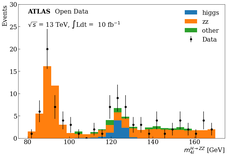
fig, ax = plt.subplots()
fig.set_size_inches((12, 8))
plot_data(stack_data_list_m4l, ranges[0], bins)
ax.hist(
    stack_mc_list_m4l,
    range=ranges[0],
    label=mc_samples,
    stacked=True,
    weights=stack_weights_list,
    bins=bins,
)
ax.set_ylabel("Events", loc="top")
ax.set_xlabel(r"$m^{H \rightarrow ZZ}_{4l}$" + units, loc="right")
ax.tick_params(which="both", direction="in", length=6, width=1)
ax.text(80, 28, "ATLAS", weight="bold")
ax.text(93, 28, "Open Data")
ax.text(80, 25, r"$\sqrt{s}$" + " = 13 TeV," + " $\int$Ldt = " + " 10 fb" + r"$^{-1}$")
ax.set_ylim(0, 30)
ax.legend(frameon=False)
Final Plot
You can see at 125 GeV the component corresponding at the Higgs boson.
Bonus: If you are more curious about other HEP analysis tools, you can take a look at this same example developed with the ROOT framework here.
Key Points
In High-energy physics, histograms are used to analyze different data and MC distributions.
With Matplotlib, data can be binned and histograms can be plotted in a few lines.
Using Uproot and Matplotlib, data in ROOT files can be display without need of a full ROOT installation.
Histograms can be stacked and/or overlapped to make comparison between recorded and simulated data.
Plotting with mplhep for HEP style plotting
Overview
Teaching: 30 min
Exercises: 15 minQuestions
How can I plot data at publication quality?
Which styles from HEP experiments are available?
Objectives
Learn how to reproduce a plot with HEP experiments style using mplhep
Introduction
Here we will be using an example from CERN Open Data Portal to reproduce a plot for a Higgs hunt. All the material is being used directly from this Google Colab notebook
The data we use here are actual, meaningful data from the CMS experiment that confirmed the existence of this elusive particle, which then resulted in a Nobel prize. Instead of hiding somewhere under ready made graphs, it is now yours to explore. The example is based on the original code in http://opendata.cern.ch/record/5500 on the CERN Open Data portal (Jomhari, Nur Zulaiha; Geiser, Achim; Bin Anuar, Afiq Aizuddin; (2017). Higgs-to-four-lepton analysis example using 2011-2012 data. CERN Open Data Portal. DOI:10.7483/OPENDATA.CMS.JKB8.RR42), and worked to a notebook by Tom McCauley (University of Notre Dame) and Peitsa Veteli (Helsinki Institute of Physics).
The method used is pretty common and useful for many purposes. First we have some theoretical background, then we make measurements and try to see if those measurements contain something that correlates or clashes with our assumptions. Perhaps the results confirm our expectations, bring up new questions to look into, force us to adapt our theories or require entirely new ones to explain them. This cycle then continues time and time again.
Install mplhep and setup
pip install mplhep
import mplhep as hep
import numpy as np
import pandas as pd
import matplotlib.pyplot as plt

hep.style.use("CMS")
# or use any of the following
# {CMS | ATLAS | ALICE | LHCb1 | LHCb2}
Getting the data
Now we will get some data stored in a github repository.
# Data for later use.
file_names = [
    "4e_2011.csv",
    "4mu_2011.csv",
    "2e2mu_2011.csv",
    "4mu_2012.csv",
    "4e_2012.csv",
    "2e2mu_2012.csv",
]
basepath = "https://raw.githubusercontent.com/GuillermoFidalgo/Python-for-STEM-Teachers-Workshop/master/data/"

# here we have merged them into one big list and simultaneously convert it into a pandas dataframe.
csvs = [pd.read_csv(f"{basepath}{file_name}") for file_name in file_names]

fourlep = pd.concat(csvs)
In this chapter we will see how to use mplhep commands to make a quality plot.
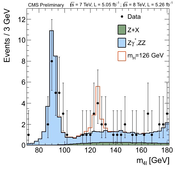
This is our goal
Let’s begin!
According to the standard model, one of the ways the Higgs boson can decay is by first creating two Z bosons that then decay further into four leptons (electrons, muons…). It isn’t the only process with such a final state, of course, so one has to sift through quite a lot of noise to see that happening. The theory doesn’t say too much about what the mass of Higgs could be, but some clever assumptions and enlightened guesses can get you pretty far. For an example, four lepton decay is very dominant in some mass regions, which then guides our search.
# Let's set some values here in regards to the region we're looking at.

rmin = 70
rmax = 181
nbins = 37

M_hist = np.histogram(fourlep["M"], bins=nbins, range=(rmin, rmax))
# the tuple `M_hist` that this function gives is so common in python that it is recognized by mplhep plotting functions


hist, bins = M_hist  # hist=frequency ; bins=Mass values
width = bins[1] - bins[0]

center = (bins[:-1] + bins[1:]) / 2
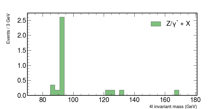
Let’s look at some simulations from other processes there. Here are some Monte Carlo simulated values for such events that have already been weighted by luminosity, cross-section and number of events. Basically we create a set of values that have some randomness in them, just like a real measurement would have, but which follows the distribution that has been observed in those processes.
Copy and paste these lines to your code
# fmt: off
dy = np.array([0,0,0,0,0,0.354797,0.177398,2.60481,0,0,0,0,0,0,0,0,0,0.177398,0.177398,0,0.177398,0,0,0,0,0,0,0,0,0,0,0,0.177398,0,0,0,0])

ttbar = np.array([0.00465086,0,0.00465086,0,0,0,0,0,0,0,0.00465086,0,0,0,0,0,0.00465086,0,0,0,0,0.00465086,0.00465086,0,0,0.0139526,0,0,0.00465086,0,0,0,0.00465086,0.00465086,0.0139526,0,0])

zz = np.array([0.181215,0.257161,0.44846,0.830071,1.80272,4.57354,13.9677,14.0178,4.10974,1.58934,0.989974,0.839775,0.887188,0.967021,1.07882,1.27942,1.36681,1.4333,1.45141,1.41572,1.51464,1.45026,1.47328,1.42899,1.38757,1.33561,1.3075,1.29831,1.31402,1.30672,1.36442,1.39256,1.43472,1.58321,1.85313,2.19304,2.95083])

hzz = np.array([0.00340992,0.00450225,0.00808944,0.0080008,0.00801578,0.0108945,0.00794274,0.00950757,0.0130648,0.0163568,0.0233832,0.0334813,0.0427229,0.0738129,0.13282,0.256384,0.648352,2.38742,4.87193,0.944299,0.155005,0.0374193,0.0138906,0.00630364,0.00419265,0.00358719,0.00122527,0.000885718,0.000590479,0.000885718,0.000797085,8.86337e-05,0.000501845,8.86337e-05,0.000546162,4.43168e-05,8.86337e-05])
# fmt: on
We will look at how these numbers contribute what is measured in the accelerators. Let’s look at each individual contribution and then put it all together.
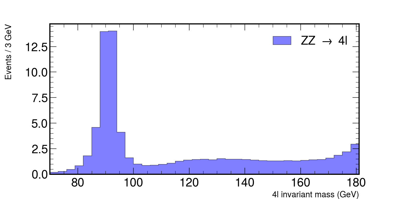
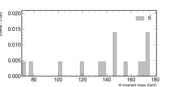
# ZZ, a pair of heavier bosons.

fig, ax = plt.subplots(figsize=(10, 5))
hep.histplot(
    zz,
    bins=bins,
    histtype="fill",
    color="b",
    alpha=0.5,
    edgecolor="black",
    label=r"ZZ $\rightarrow$ 4l",
    ax=ax,
)

ax.set_xlabel("4l invariant mass (GeV)", fontsize=15)
ax.set_ylabel("Events / 3 GeV", fontsize=15)
ax.set_xlim(rmin, rmax)
ax.legend()
fig.show()
This would plot the following figure.
Exercise
Plot each of the backgrounds individually. You should have something similar to
Stacking histograms and adding the CMS logo.
Let’s stack them together and see what kind of shape we might expect from the experiment.
To stack histograms together with hep.histplot you can pass in a list of the values to be binned like [ttbar,dy,zz] and also set the argument stack=True.
For the legend you can also pass each corresponding label as a list. Example:
label = [r"$t\bar{t}$", "Z/$\gamma^{*}$ + X", r"ZZ $\rightarrow$ 4l"]
Also use python lists to specify the colors for each plot.
To add the CMS logo you can use the hep.cms.label() function. Look here for more information on mplhep methods like this one.
Now add the data
It’s customary to use ax.errorbar as data is usually shown with uncertainties.
You can define both errors along the x and the y axis as python lists and add them to your data.
Use this for the uncertainties.
xerrs = [width * 0.5 for i in range(0, nbins)]
yerrs = np.sqrt(hist)
Remember : Google is your friend.
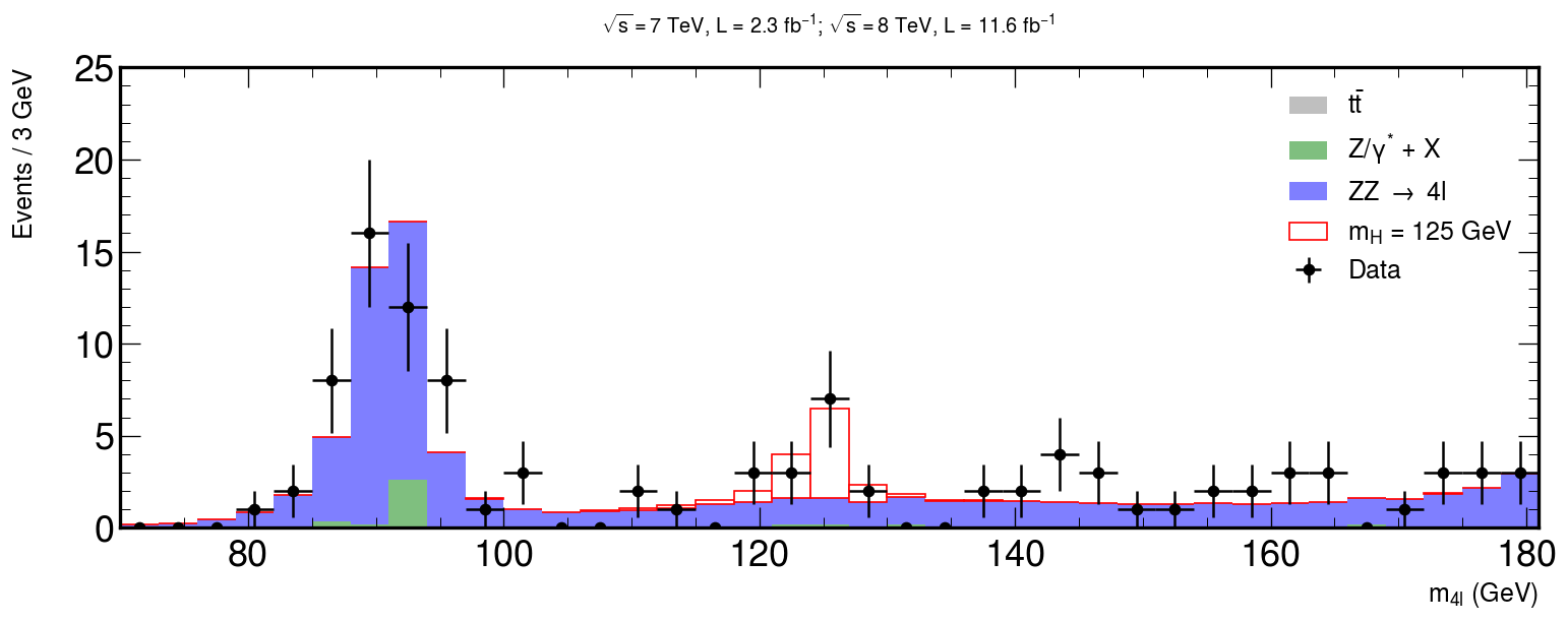
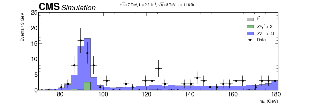
Solution (don’t look before trying yourself)
xerrs = [width * 0.5 for i in range(0, nbins)]
yerrs = np.sqrt(hist)
fig, ax = plt.subplots(figsize=(10, 5))
hep.histplot(
   [ttbar, dy, zz],
   stack=True,
   bins=bins,
   histtype="fill",
   color=["grey", "g", "b"],
   alpha=0.5,
   edgecolor="black",
   label=[r"$t\bar{t}$", "Z/$\gamma^{*}$ + X", r"ZZ $\rightarrow$ 4l"],
   ax=ax
)

# Measured data
ax.errorbar(
   center,
   hist,
   xerr=xerrs,
   yerr=yerrs,
   linestyle="None",
   color="black",
   marker="o",
   label="Data"
)

ax.title(
   "$ \sqrt{s} = 7$ TeV, L = 2.3 $fb^{-1}$; $\sqrt{s} = 8$ TeV, L = 11.6 $fb^{-1}$ \n",
   fontsize=15,
)
ax.set_xlabel("$m_{4l}$ (GeV)", fontsize=15)
ax.set_ylabel("Events / 3 GeV\n", fontsize=15)
ax.set_ylim(0, 25)
ax.set_xlim(rmin, rmax)
ax.legend(fontsize=15)
hep.cms.label(rlabel="")

fig.show()
Putting it all together
Almost there!
Now it’s just a matter of using what we have learned so far to add our signal MC of the Higgs assuming that it has a mass of 125 GeV.
The following code will plot the signal from the montecarlo simulation of our Higgs. Use the same method as before to merge everything together!
# HZZ, our theoretical assumption of a Higgs via two Z bosons.

fig, ax = plt.subplots(figsize=(10, 5))

hep.histplot(
    hzz,
    stack=True,
    bins=bins,
    histtype="fill",
    color="w",
    alpha=1,
    edgecolor="r",
    label="$m_{H}$ = 125 GeV",
    ax=ax,
)
hep.cms.label(rlabel="")
ax.legend()

ax.set_xlabel("4l invariant mass (GeV)", fontsize=15)
ax.set_ylabel("Events / 3 GeV\n", fontsize=15)
ax.set_xlim(rmin, rmax)

fig.show()
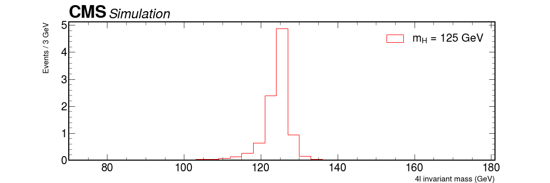
Bonus question: how can something, that seems to have a mass of roughly 125 GeV decay via two Z bosons, with mass over 90 GeV?
Add that graph with all background + data and see how it lines up.
Solution
fig, ax = plt.subplots(figsize=(15, 5))

xerrs = [width * 0.5 for i in range(0, nbins)]
yerrs = np.sqrt(hist)

hep.histplot(
   [ttbar, dy, zz, hzz],
   stack=True,
   bins=bins,
   histtype="fill",
   color=["grey", "g", "b", "w"],
   alpha=[0.5, 0.5, 0.5, 1],
   edgecolor=["k", "k", "k", "r"],
   label=[
       r"$t\bar{t}$",
       "Z/$\gamma^{*}$ + X",
       r"ZZ $\rightarrow$ 4l",
       "$m_{H}$ = 125 GeV",
   ],
   ax=ax
)

hep.cms.label(rlabel="")

# Measured data
ax.errorbar(
   center,
   hist,
   xerr=xerrs,
   yerr=yerrs,
   linestyle="None",
  color="black",
   marker="o",
   label="Data"
)

ax.title(
   "$ \sqrt{s} = 7$ TeV, L = 2.3 $fb^{-1}$; $\sqrt{s} = 8$ TeV, L = 11.6 $fb^{-1}$ \n",
   fontsize=16,
)
ax.set_xlabel("$m_{4l}$ (GeV)", fontsize=15)
ax.set_ylabel("Events / 3 GeV\n", fontsize=15)
ax.set_ylim(0, 25)
ax.set_xlim(rmin, rmax)
ax.legend(fontsize=15)

fig.savefig("final-plot.png", dpi=140)
fig.show()
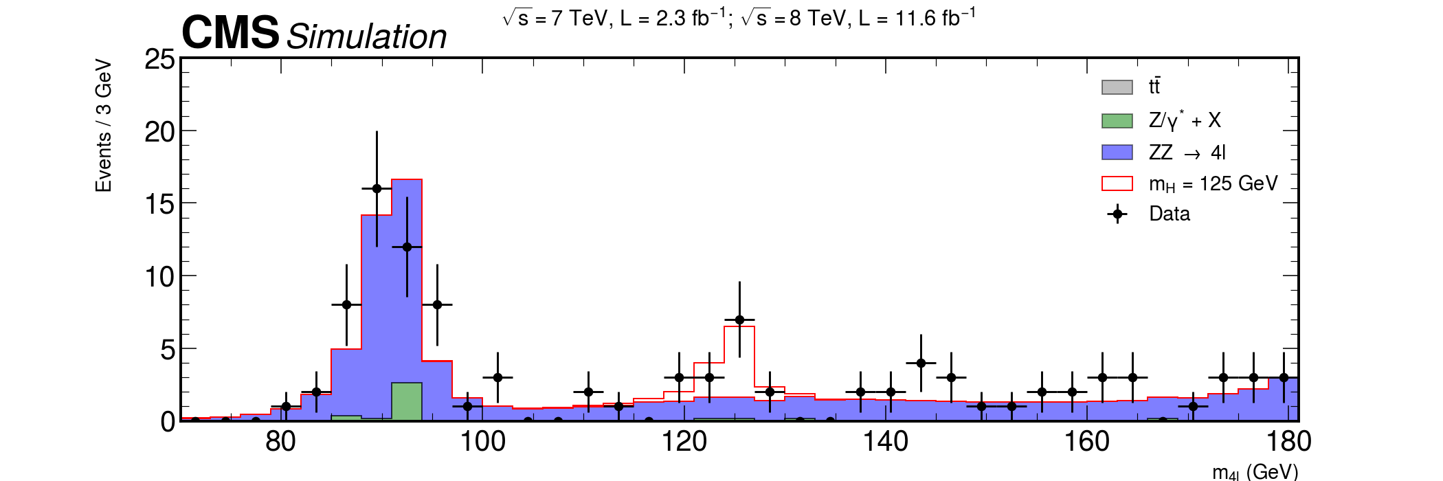
Done! We are ready to publish :)
Key Points
Mplhep is a wrapper for easily apply plotting styles approved in the HEP collaborations.
Styles for LHC experiments (CMS, ATLAS, LHCb and ALICE) are available.
If you would like to include a style for your collaboration, ask for it opening an issue!
Coffee break
Overview
Teaching: 0 min
Exercises: 15 minQuestions
Cookies or cake?
Objectives
You have been doing it great. Get a sweet reward ;)
The Coffee break page is inspired from the HSF Introduction to Docker lesson!
Key Points
Dimuon spectrum
Overview
Teaching: 45 min
Exercises: 15 minQuestions
Can you get the di-muon mass spectrum with Matplotlib and mplhep?
Objectives
Time to apply your knowledge for producing a nice plot!
Learn about other data formats beside ROOT
Introduction
Looking at the dimuon spectrum over a wide energy range
Learning goals
- Relativistic kinematics.
- Mesons.
Background
To determine the mass (\(m\)) of a particle you need to know the 4-momenta of the particles (\(\mathbf{P}\)) that are detected after the collision: the energy (\(E\)), the momentum in the x direction (\(p_x\)), the momentum in the y direction (\(p_y\)) and the momentum in the z direction (\(p_z\)).
[\mathbf{P} = (E,p_x,p_y,p_z)]
[m = \sqrt{E^2-(p_x^2+p_y^2 + p_z^2)}]
Some particles are very unstable and decay (turn into) to two or more other particles. In fact, they can decay so quickly, that they never interact with your detector! Yikes!
However, we can reconstruct the parent particle (sometimes referred to as the initial state particle) and its 4-momentum by adding the 4-momenta of the child particles (sometimes referred to as the decay products).
[\mathbf{P_{\rm parent}} = \mathbf{P_{\rm child 0}} + \mathbf{P_{\rm child 1}} + \mathbf{P_{\rm child 2}} + …]
which breaks down into…
[E_{\rm parent} = E_{\rm child 0} + E_{\rm child 1} + E_{\rm child 2} + …]
[p_{\rm x parent} = p_{\rm x child 0} + p_{\rm x child 1} + p_{\rm x child 2} + …]
[p_{\rm y parent} = p_{\rm y child 0} + p_{\rm y child 1} + p_{\rm y child 2} + …]
[p_{\rm z parent} = p_{\rm z child 0} + p_{\rm y child 1} + p_{\rm z child 2} + …]
Let’s code!
Here is some very, very basic starter code. It reads in data from the CMS experiment.
Challenge!
Use the sample code to find the mass of the particle that the two muons came from (parent particle).
To do this, you will need to loop over all pairs of muons for each collision, sum their 4-momenta (energy, px, py, and pz) and then use that to calculate the invariant mass.
Do this for all pairs of muons for the case where the muons have opposite charges.
Hint!
It is very likely that a particle exists where there is a peak in the data. However, this is not always true. A peak in the data is most likely the mass of a particle. You can look at the approximate mass to figure out which particle is found in the data.
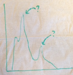
Your histogram should look something like the following sketch. The value of the peaks should be the mass of a particle. You should be able to find two particles in their ground state. Check your answer for the first particle! Check your answer for the second particle!
from IPython.display import Image

Image(
    url="https://raw.githubusercontent.com/particle-physics-playground/playground/master/activities/images/dimuons_sketch.jpeg"
)
import numpy as np
import h5py
import matplotlib.pyplot as plt
import mplhep as hep

plt.style.use("default")
Decide which styling you want to use
# This is the default style for matplotlib, do not change this cell if you desire this option
plt.style.use("default")

# This is the mplhep style, uncomment this line for this styling.
# hep.style.use("ROOT")
Load the data
#  Make sure you have the correct path to the dimuon file!
event = h5py.File("./data-ep07-dimuonspectrum/dimuon100k.hdf5", mode="r")
And now extract it and perform sum
e = event["muons/e"][:]
px = event["muons/px"][:]
py = event["muons/py"][:]
pz = event["muons/pz"][:]

# We will check for muons that do not pass the kinematics
print(len(px))  # Number of muons

# See if there are any anomalies and clean them out
cut = (e**2 - (px**2 + py**2 + pz**2)) < 0

print(sum(cut))  # Count how many anomalies
200000
343
We can use numpy to clean our arrays from anomalous events
e = np.delete(e, cut)
px, py, pz = np.delete(px, cut), np.delete(py, cut), np.delete(pz, cut)
Let’s calculate the mass
M = (e**2 - (px**2 + py**2 + pz**2)) ** 0.5
Make a histogram of the values of the Mass
fig, ax = plt.subplots()
ax.hist(
    M,
    bins=100,
    histtype="step",
)

ax.set_xlabel(r"$\mu_{mass}$ [GeV]")
ax.set_title("Muon Mass spectrum")
plt.show()
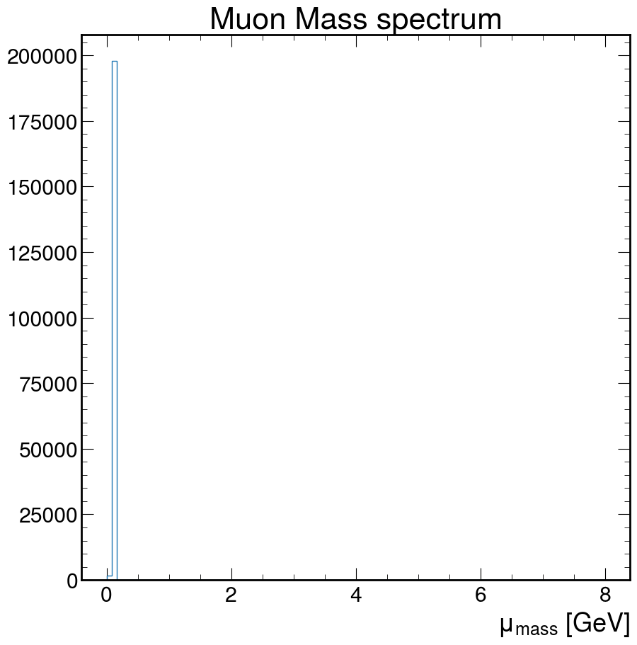
Doesn’t really look like much. How about we fix that!
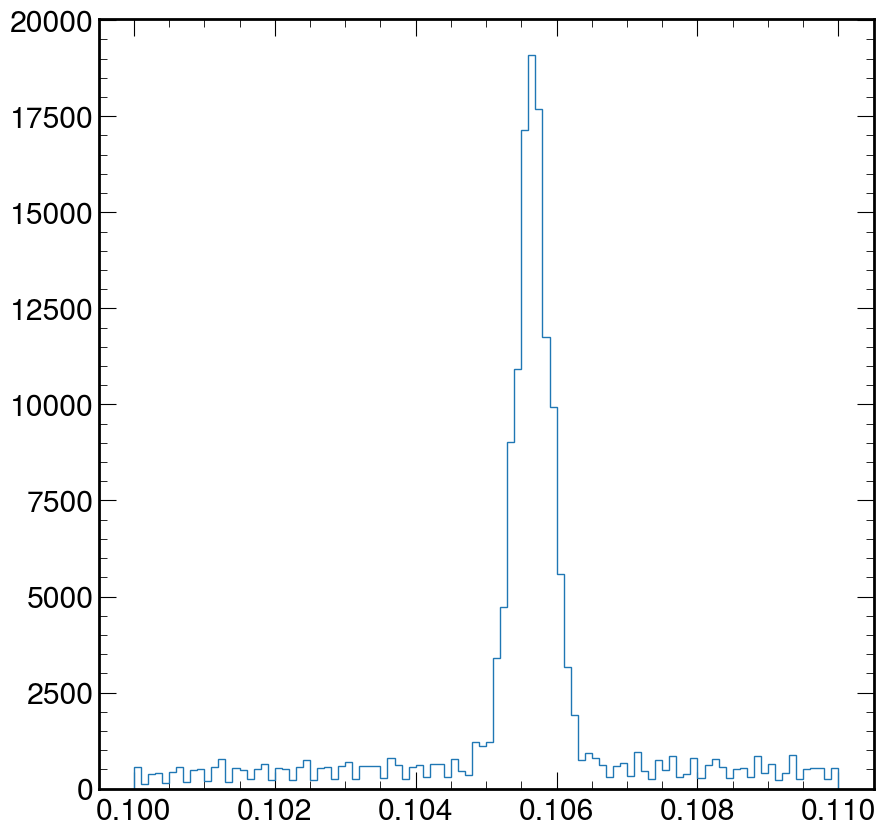
Exercise:
Using the code above, zoom in and fix the above plot to help visually estimate the mass of the muon. Where is the value of the peak at?
Hint: Google search for the arguments of the ax.hist function
Solution
fig, ax = plt.subplots()
ax.hist(M, bins=100, log=False, histtype="step", range=(0.1, 0.11))
plt.show()
Let’s make the dimuon spectrum
We need to calculate the sum the energies at the event level
REMEMBER
[E_{\rm parent} = E_{\rm child 0} + E_{\rm child 1} + E_{\rm child 2} + …]
[p_{\rm x parent} = p_{\rm x child 0} + p_{\rm x child 1} + p_{\rm x child 2} + …]
[p_{\rm y parent} = p_{\rm y child 0} + p_{\rm y child 1} + p_{\rm y child 2} + …]
[p_{\rm z parent} = p_{\rm z child 0} + p_{\rm y child 1} + p_{\rm z child 2} + …]
Calculating the invariant mass of all particles
Let us first implement this with a loop:
def invmass(e, px, py, pz):
    etot, pxtot, pytot, pztot = 0, 0, 0, 0

    # This loops over all of the 4-momentums in the list, and adds together all of their energy,
    # px, py, and pz components
    for i in range(len(e)):
        etot += e[i]
        pxtot += px[i]
        pytot += py[i]
        pztot += pz[i]
        # uses the total energy,px,py,and pz to calculate invariant mass
        m2 = etot**2 - (pxtot**2 + pytot**2 + pztot**2)
    return np.sqrt(abs(m2))
However, you might recall that python loops can be a performance issue.
It doesn’t matter if you’re looping over a few hundred iterations, but if you’re looking at millions of events, it’s a problem.
Let’s use numpy to write the same code in a more compact and performant style:
def invmass(e, px, py, pz):
    return np.sqrt(
        np.abs(
            e.sum(axis=-1) ** 2
            - (px.sum(axis=-1) ** 2 + py.sum(axis=-1) ** 2 + pz.sum(axis=-1) ** 2)
        )
    )
You might be wondering about the axis=-1 that we used. This is because it allows our function to both operate on one-dimensional arrays (all particles in an event), or
two-dimensional arrays (all particles in many events, with the first dimension being that of the events).
Looping over all the muons and checking for the possible charge combinations
First, let’s assume that each event only has 2 muons. We will loop over both muons and keep under separate lists those with same charge (+,+) or (-,-) and those with opposite charge (+-,-+). We can do this with a simple python loop:
# These lists collect the invariant masses
pp = []  # positive positive
nn = []  # negative negative
pm = []  # opposite charges
M = []  # all combinations

for i in range(0, len(q) - 1, 2):  # loop every 2 muons
    # Make a list with information for 2 muons
    E = [e[i], e[i + 1]]
    PX = [px[i], px[i + 1]]
    PY = [py[i], py[i + 1]]
    PZ = [pz[i], pz[i + 1]]
    M.append(invmass(E, PX, PY, PZ))
    if q[i] * q[i + 1] < 0:
        pm.append(invmass(E, PX, PY, PZ))
    elif q[i] + q[i + 1] == 2:
        pp.append(invmass(E, PX, PY, PZ))
    elif q[i] + q[i + 1] == -2:
        nn.append(invmass(E, PX, PY, PZ))
    else:
        print("anomaly?")
print("Done!")
Hoewver, again the proper way to do this is with numpy. It might be harder to read at first, but once you get used to the syntax, it is actually more transparent:
# Use "reshape" to create pairs of particles
masses = invmass(
    e.reshape(-1, 2), px.reshape(-1, 2), py.reshape(-1, 2), pz.reshape(-1, 2)
)

q_pairs = q.reshape(-1, 2)

# Create masks for our selections
pm_mask = q_pairs[:, 0] * q_pairs[:, 1] < 0
pp_mask = q_pairs[:, 0] + q_pairs[:, 1] == 2
nn_mask = q_pairs[:, 0] + q_pairs[:, 1] == -2

anomaly = ~(pm_mask | pp_mask | nn_mask)
if anomaly.any():
    print(f"{anomaly.sum()} anomalies detected")

pp, nn, pm = masses[pp_mask], masses[nn_mask], masses[pm_mask]
Now we plot for all combinations
I would like you to make these 4 histograms in 4 different ways focusing on on different mass ranges. To look at these mass ranges, you’ll want to use the bins and range options in the ax.hist() function.
- Mass range 1: 0 - 120
- Mass range 2: 2 - 4
- Mass range 3: 8 - 12
- Mass range 4: 70 - 120
Remember, you’ll have 4 charge combinations for each of these histograms.
- All charge combinations
- Only positive muons
- Only negative muons
- Only oppositly charged muons
Below I will give you some code to get you started. Please make your changes/additions below this cell and look at each mass range.
# Arguments shared by the .hist calls:
kwargs = dict(
    bins=100,
    histtype="step",
)
fig, ax = plt.subplots(2, 2, figsize=(16, 10))

ax[0][0].hist(M, range=(0, 120), label="All charge combinations", **kwargs)
ax[0][1].hist(pp, range=(0, 120), label="$2+$", **kwargs)
ax[1][0].hist(nn, range=(0, 120), label="$2-$", **kwargs)
ax[1][1].hist(pm, range=(0, 120), label="Electrically neutral", **kwargs)

for irow in range(2):
    for icol in range(2):
        ax[irow][icol].set_xlabel(r"Mass (GeV/c$^2$)", fontsize=14)
        ax[irow][icol].legend(fontsize=18)

plt.tight_layout()
Exercise: Now calculate the mass per event and make the plot.
Hint!
You could use the np.logspace() function for the binning. It helps in returning numbers spaced evenly on a log scale. You can find out more about it here.
Solution
logbins = np.logspace(0, 2.5, 200)
fig, ax = plt.subplots()
ax.hist(pm, bins=logbins, histtype="step")
ax.set_xlabel("mass (GeV/$c^2$)")
ax.set_ylabel("Events")
ax.set_xscale("log")
ax.set_title("Mass of dimuons per event")
ax.autoscale()

plt.show()
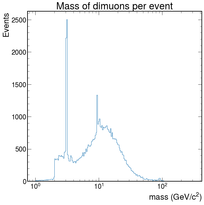
Depending on what you did, you may see hints of particles below \(20 GeV/c^2\). It is possible you see signs of other particles at even higher energies. Plot your masses over a wide range of values, but then zoom in (change the plotting range) on different mass ranges to see if you can identify these particles.
Image(
    url="https://twiki.cern.ch/twiki/pub/CMSPublic/HLTDiMuon2017and2018/CMS_HLT_DimuonMass_Inclusive_2017.png"
)

Key Points
Any data format that can be loaded as an object in Python can be plotted using Matplotlib.
Not always the default values will provide meaningful plots. When needed try to zoom changing the ranges in the distributions.
When in doubt, check the documentation! The web is also full of good examples.